
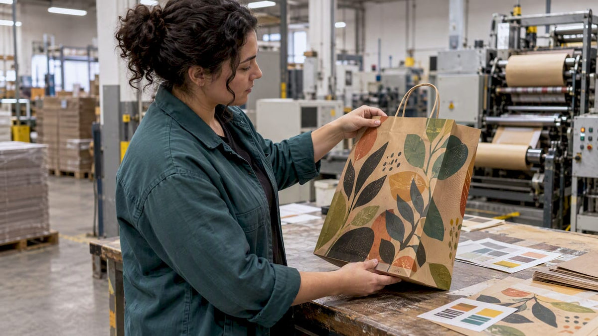
Yes, you can print on recycled kraft, but the paper’s higher absorption and lower brightness mean the result depends on material-aware choices, not luck. Expect visible color shift from the brown fiber and plan ink system, paper grade, and a pre-production sample before committing to a full run. Checking roughness against TAPPI benchmarks and working with a converter like Gather Packaging on a physical proof removes most of the guesswork.
TL;DR:
- Recycled kraft paper’s higher absorbency and lower brightness require material-aware ink and process adjustments, with pre-production sampling recommended.
- Surface roughness and fiber source significantly impact print quality, with smoother surfaces and unbleached eucalyptus fibers offering better results over multiple recycling cycles.
- Flexographic printing remains the most suitable method for high-volume jobs on recycled kraft, while digital printing suits short runs and variable data with primer or pretreatment.
- Artwork should incorporate white underprints or expanded-gamut setups to ensure accurate brand color reproduction on the brown stock.
- Consistent production relies on controlling ink type, press parameters, and thorough testing; full prototypes should be produced before mass printing.
Table of Contents
- How recycled fiber and surface texture affect print quality
- Which printing method actually works on recycled kraft?
- How should you prepare artwork for recycled kraft?
- What production controls keep a kraft print run consistent?
- How Gather Packaging builds these controls into every kraft bag order
- When recycled kraft is the right call and when it isn’t
- Ready to run a kraft print job that holds up at scale?
- Sources
- FAQ
How recycled fiber and surface texture affect print quality
Recycled kraft behaves differently on press than virgin stock because the fiber itself has been through a pulping and drying cycle before. Adding post-consumer fiber tends to increase surface roughness and lower brightness, though a printability study on sheets with recycled secondary fiber found that flexo and gravure trials still produced acceptable tonal response once the press was set up for the substrate. Fiber source matters too: TAPPI research on softwood and hardwood kraft pulps found that unbleached eucalyptus-based pulps hold their functional properties through more recycling cycles than some softwood pulps, which is worth asking your paper supplier about if recyclability claims matter for your brand.
Surface roughness is the practical lever. TAPPI technical proceedings link roughness parameters, measured with methods such as Parker Print Surf under TAPPI T577, directly to ink optical density: flatter peaks reflect more light off printed areas and read as richer color. A reliable paper supplier or printer should be able to share roughness and absorbency data on request. Useful specs to ask for:
- Parker Print Surf (roughness) readings, since lower values generally mean better ink holdout.
- Cobb absorbency values, which show how much liquid (and ink) the sheet pulls in.
- Ring crush strength, which affects bag durability more than print but still matters for a packaging decision.
- Post-consumer waste (PCW) percentage, since higher PCW can mean more variability sheet to sheet.
For jobs where color accuracy is critical, a converter or white kraft grade often outperforms standard brown kraft on legibility and sharpness.
Which printing method actually works on recycled kraft?
The right process depends on run length, color complexity, and how much the brown base is allowed to show through.
- Flexographic printing is the standard for high-volume shopping bags. An 8-color flexo setup widens the available gamut and gets closer to a brand’s exact color on brown stock, though ink viscosity needs monitoring closely since kraft’s absorbency pulls moisture out of water-based inks faster than coated papers do.
- Offset printing can work well, but mostly on converter or white kraft rather than raw uncoated brown stock, where fine screens and photographic detail tend to lose sharpness.
- Digital printing, inkjet or toner, suits short runs and variable data such as store names or batch codes. Pigment inks and a primer or pretreatment step usually improve holdout, since technical roughness research found that primers mitigate the color loss roughness otherwise causes on absorbent boards.
- Screen printing earns its place when a design calls for heavy ink lay-down, metallics, or specialty finishes that other methods cannot deposit in sufficient volume. It costs more per unit and runs slower, so it tends to fit smaller or premium batches rather than everyday retail volume.
Most shopping bag programs end up on flexo for volume and cost, with digital reserved for prototypes, short runs, or personalization.
How should you prepare artwork for recycled kraft?
Design files need to account for the brown base from the first draft, not as a fix applied after a bad proof comes back. A spot white underprint acts as an opaque base beneath other colors, which restores truer color on brown stock, though it adds a plate, requires careful trapping, and increases setup cost. For brand colors that must hold tight, an expanded-gamut flexo setup or white underprint gets Pantone closer to its coated-stock appearance than CMYK alone ever will on kraft; the tradeoffs between Pantone and CMYK are worth understanding before you lock a brand palette to a substrate you have not tested.
A few rules keep most kraft jobs out of trouble:
- Avoid fine halftones and tight gradients, since dot gain is higher on absorbent, rough stock.
- Increase type weight and minimum stroke width so small text does not fill in or disappear.
- Build artwork as vector shapes where possible rather than relying on fine raster detail.
- Set trapping generously around any spot white or reverse elements.
Pro Tip: Request a digital mockup first, then a press strike, then a full pre-production prototype. Each stage catches different problems, and skipping straight to a prototype often means repeating the whole sequence anyway.
What production controls keep a kraft print run consistent?
Consistency on kraft comes from controlling a short list of variables rather than hoping the stock behaves.
- Choose ink by end use. Water-based pigment inks are the standard choice for sustainability and lower migration risk, while UV or solvent systems are sometimes justified for specialty finishes but carry added cost and, for food-contact bags, extra scrutiny.
- Hold press parameters steady. Monitor ink viscosity through the run, run at a slightly slower press speed than you would on coated stock, and use drying or IR units tuned for an absorbent sheet rather than a coated one.
- Test before and during the run. Adhesion, rub and abrasion resistance, Cobb absorbency, and color-target checks against an approved proof all belong in a standard QA pass; food-contact bags need migration testing and SDS documentation for any ink used.
- Prototype before committing to volume. A pre-production sample made on the actual paper and ink combination is the clearest way to catch color or legibility problems before they show up across a full production run.
How Gather Packaging builds these controls into every kraft bag order
Gather Packaging runs these controls as standard practice rather than optional add-ons. Manufacturing happens domestically, with FSC-certified and recycled materials, water-based inks, and 8-color flexo printing that gives designers more room to hold brand colors on brown stock. Pre-production prototyping and in-house quality assurance run on every order before it reaches full volume.
To get an accurate quote and a useful first prototype, send a verified dieline, your Pantone or color targets, the intended use case (retail display versus food takeout), and any strength or durability specs the bag needs to meet. That information lets the production team match ink system and paper grade to the job instead of guessing.

When recycled kraft is the right call and when it isn’t

Recycled kraft earns its reputation for eco positioning, visible texture, and durable retail use, and it holds up well for brand marks, type, and simple graphics. It is a poor fit for photographic imagery or wide color gamuts unless you budget for white underprint, expanded-gamut flexo, or a converter-grade sheet, because the brown base will shift everything without that extra work.
The practical move is to accept a small amount of color variance as part of the material’s character, or specify white kraft when a brand color is non-negotiable. Either way, budget for a prototype round before production, not after a complaint.
— Taylor
Ready to run a kraft print job that holds up at scale?
Getting from a design file to a finished bag goes faster when a manufacturer handles die-lines, color targets, and prototyping under one roof instead of passing the job between separate vendors.
Gather Packaging works through the same sequence outlined above on every order:
- Send your dieline, Pantone or color targets, and intended use (retail or takeout food).
- Request a pre-production prototype on the actual paper and ink combination you plan to run.
- Review the press strike, approve color, and move to full production.
Browse the Turn Top, Serrated Top, and Tamper-Resistant bag styles or reach out through the consultation and quotation page to talk through ink selection, food-contact requirements, and lead times for your next order.
Sources
The guidance above draws on published research into recycled fiber printability, substrate roughness, and fiber recyclability, alongside Canadian recycling data relevant to packaging supply. The printability study on recycled secondary fiber sheets and the TAPPI roughness and print quality proceedings cover the technical mechanics of ink and substrate interaction. The TAPPI study on softwood and hardwood kraft pulp recycling and Canadian packaging board data on recycled paper use in packaging mills provide the fiber and supply context. For a broader view of eco-packaging as a brand strategy, see this perspective on eco-friendly brand packaging.
- TAPPI conference paper: roughness measurements and print quality
- Printability study on sheets with post-consumer secondary fiber (WMU thesis)
- Recycling performance of softwood and hardwood unbleached kraft pulps for packaging papers (TAPPI)
FAQ
Can you print on kraft paper?
Yes, kraft paper accepts flexo, offset, digital, and screen printing, though the brown base and higher absorbency affect color and detail. Choosing the right ink system and requesting a press proof on the actual stock avoids most surprises.
Can you print on cardboard paper?
Cardboard and corrugated board can be printed using similar flexo or digital methods, but the heavier, often fluted surface behaves differently from sheet kraft and typically needs its own press setup and proofing. The same roughness and ink holdout principles apply, just at a different scale of substrate.
Can I recycle paper that’s been printed on?
Printed kraft paper is generally recyclable, and TAPPI research on kraft pulp recycling shows that fiber type affects how many cycles a sheet can go through while keeping its properties. Water-based inks are generally considered easier to process in standard paper recycling streams than solvent or UV-cured systems.
Is it possible to print on handmade paper?
Handmade paper can be printed, but its uneven surface and variable thickness make it far less predictable than mill-produced kraft, so results depend heavily on the sheet and process used. For consistent branded packaging at any real volume, a controlled kraft stock with documented roughness and absorbency values is the more reliable choice.
Share:
Contract Ready Handle Strength Testing Specs for Paper Bag Buyers
Ink Rub Resistance Checklist for Paper Bag QC: ASTM D5264 & TAPPI T830