
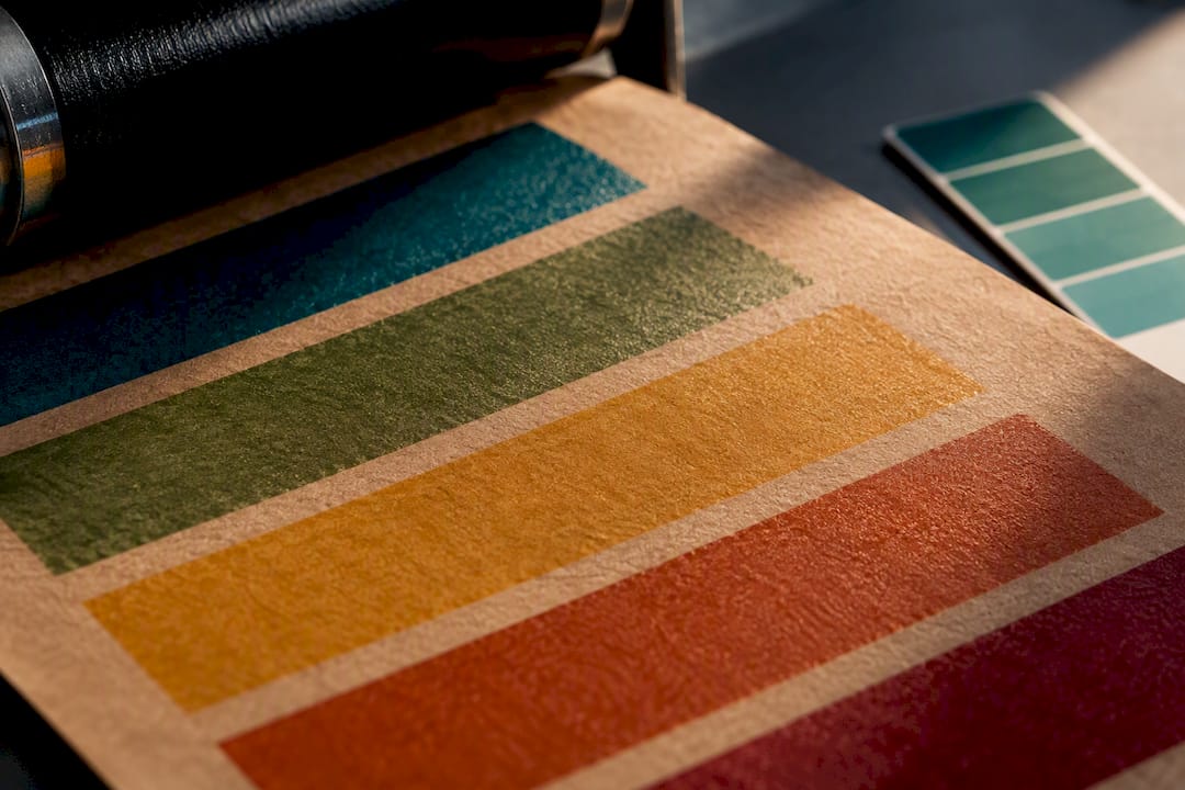
Yes, you can get a reliable Pantone or brand-color match on kraft, but not by handing a converter a swatch number and hoping. The brown substrate absorbs and reflects light differently than white stock, so any match that holds up run after run depends on a white underprint or reserved spot inks, plus measurable references like Lab* or CxF and a signed production sample. If exact color fidelity is non-negotiable, budget for that extra step; if it isn’t, kraft’s natural tone is often the better design choice anyway.
TL;DR:
- Achieving exact Pantone matches on kraft requires a white underprint, measurable color references, and signed samples, due to the substrate’s influence on light and color.
- Variations in kraft paper’s shade, porosity, fiber content, and coating significantly impact color accuracy, making substrate consistency essential for color control.
- Using spot Pantone or CMYK directly on kraft causes color shifts; white underprint or lamination is recommended for precise color fidelity, especially for bright or pastel hues.
- Press method and plate design, particularly flexo with specific anilox and dot gain control, influence how colors appear and must be optimized for predictable results.
- Locking in color consistency between runs depends on detailed prepress specs, a measured strike-off, and retention of ink recipes, with paper lot control preventing shade discrepancies.
Table of Contents
- Why Pantone and Process Colors Shift on Kraft Paper
- Spot Pantone, CMYK, and White Underprint: Choosing Your Ink Strategy
- How Press Method Changes Pantone Results on Kraft
- Prepress Specs That Actually Lock a Color Match
- Design Choices That Work With Kraft Instead of Against It
- Production QA: Locking the Match for Every Reorder
- How Gatherpackaging Handles Pantone Matching on Kraft Bags
- What a Practitioner Wants Designers to Know
- Ready to Prototype Your Brand Color on Kraft?
- Sources
- FAQ
Why Pantone and Process Colors Shift on Kraft Paper
A Pantone chip looks the way it does because it’s printed on bright white stock. Kraft paper starts life as an unbleached, tan to brown sheet, and that base color acts like a filter sitting under every ink you print. It absorbs certain wavelengths and reflects others, which pulls warm colors deeper into brown territory and mutes cool colors like blues and greens. A Pantone that reads clean and bright on a coated white carton can look muddy or shifted a full shade darker on kraft, even when the ink formula on press is identical.
Two other mechanics compound the problem. Uncoated kraft is porous, so ink soaks into the fiber instead of sitting cleanly on top. That increases dot gain, meaning small halftone dots spread and merge, filling in fine detail and darkening solid areas more than the same plate would on coated board. And kraft itself isn’t one consistent material. Shade, recycled fiber content, and surface texture vary by paper lot and by mill, which is why converters often recommend locking a specific paper grade before running a job rather than treating “kraft” as a single interchangeable substrate.
A few substrate factors worth tracking before you approve artwork:
- Basis weight (grammage): heavier stock generally holds ink more predictably and resists show-through.
- Recycled fiber percentage: higher recycled content can introduce more shade variation between lots.
- Coating: an uncoated sheet increases absorbency and dot gain versus a lightly coated kraft.
- Bleach level: unbleached kraft runs darker and more variable than lightly bleached versions.
Trade data on kraft pouches and flexible packaging backs this up: shade, grammage, and coating differences are directly tied to color variation and matchability on brown substrates, with thicker, more consistent stock generally giving tighter control.
Spot Pantone, CMYK, and White Underprint: Choosing Your Ink Strategy
Spot Pantone ink printed straight onto kraft still interacts with that brown base the same way process colors do. A PMS spot color mixed to spec on white paper will look darker, warmer, and less saturated once it hits kraft, because the ink is semi-transparent and the substrate shows through it. This is a real problem in practice. Print forums are full of job reports where a color like PMS 2767C printed directly on brown kraft came back visibly off from the target, forcing iterative adjustments before the job could ship.
CMYK is efficient for photography, gradients, and any artwork with a wide color range, since it lets you print four inks instead of managing a separate plate for every spot color. But CMYK builds are even more exposed to substrate interference than solid spot inks, because each of the four process colors is thinner and more transparent on its own.
Here’s how the three main strategies stack up:
- Spot Pantone with no backing. Cheapest and fastest, but expect a visible shift toward brown and reduced saturation, especially in lighter or brighter Pantone families.
- White underprint (flood or selective) beneath spot or CMYK inks. Restores brightness and saturation closest to the original swatch, but adds a press station, ink cost, and a drying/curing step. Selective white (only under the color areas that need it) costs less than a full flood coat and can look more intentional as a design choice.
- Litho-lamination to a white board face, with kraft used elsewhere on the piece. A practical route when full-color photography or brand graphics need to look correct, while kraft carries the sustainability story on the rest of the bag. Trade guides on box printing point to white underprint or lamination as the two realistic fixes once a brand decides exact color fidelity actually matters.
Finishes like foil stamping, blind embossing, or spot gloss varnish deserve a mention here too, because they add shine, texture, or contrast without focusing on exact color replication, making them smart choices for visual impact.
Pro Tip: If your logo has one dominant brand color and the rest of the design is typography or line art, selective white underprint under just that one element usually delivers 90% of the visual benefit at a fraction of the cost of a full white flood.
How Press Method Changes Pantone Results on Kraft
The press process you run on matters as much as the ink you choose. Most kraft shopping bags are printed flexo, which uses flexible rubber or photopolymer plates and a metered ink film applied through an anilox roll. Plate surface structure and anilox cell volume both directly affect how much ink lands on the sheet and how much dot gain you get. Testing on flexo plate structures has shown that optimized microcell surfaces and platemaking parameters measurably improve density and printability on kraft substrates/t190176.pdf?sfvrsn=130672fc_2), particularly when combined with modern flat-top-dot plate technology that resists the halftone spreading uncoated stock is prone to.
A few press-side variables worth putting in your spec conversation:
- Anilox line count and volume: higher volume increases ink film thickness, which can help opacity on kraft but risks over saturating fine detail.
- Plate durometer and surface structure: softer or textured plates transfer ink differently on rough kraft than on smooth coated stock.
- Impression pressure: too much impression increases dot gain and can emboss the fiber, changing how light reflects off the print.
- Cure or dry time: water-based inks common on kraft bags need adequate drying to hit target density without smearing on the press.
Offset and digital printing show up less often on kraft shopping bags themselves, but they matter when a brand laminates a printed white sheet onto kraft board for high-detail graphics. Digital printing also plays a role in short-run prototyping, where speed matters more than matching a full production ink recipe exactly.
One more thing worth knowing: the same Pantone number can look different from two different print vendors, even on the same substrate. That’s rarely sloppiness. It usually comes down to different ink brands, different anilox setups, or different in-house formulation databases. Digital color-matching systems that track substrate, ink type, and press configuration together are steadily replacing manual, eye-driven color matching because they produce repeatable first-pass matches instead of a new guess every time. Choosing a converter with real flexo capacity, like 8-color flexo printing with dedicated spot stations, gives you more room to isolate brand colors from the process build entirely.
Prepress Specs That Actually Lock a Color Match
A written Pantone name is not a specification. “PMS 187C” tells a converter what the color should look like on coated stock under standard lighting, but it says nothing about how that ink will behave once it hits brown, porous kraft. What actually locks a match across print runs, vendors, and even years is a measurable digital reference: Lab* coordinates and a CxF (Color Exchange Format) file that captures the exact spectral data of your approved sample.
This distinction matters enough that Pantone’s own coated and uncoated libraries (Pantone C and Pantone U) exist because the same ink formula reads differently depending on the stock, and neither library was built with kraft in mind. That gap is real enough that X-Rite, Pantone, and Sun Chemical built and released an Eco-Kraft corrugated color library for PantoneLIVE, specifically so brands could set achievable color expectations on recycled, brown substrates instead of chasing a coated-stock swatch that was never reachable on kraft in the first place.
When you send artwork to a converter, hand over more than a flat PDF. What to include:
- Separate, clearly named layers or plates for any white underbase, so it’s obvious where white sits relative to color.
- Choke and trim guidance where white needs to extend slightly past the color it backs, to avoid a visible halo at registration.
- Registration tolerance called out numerically, not just described, so press operators know how tight the fit needs to be.
Before production starts, ask for a strike-off, a small printed sample on the exact kraft grade you’ll run, measured with a spectrophotometer and recorded against a ΔE tolerance you both agree to. That ΔE number, the measured color difference between target and actual print, is the single most useful number in the entire approval process, because it turns “close enough” into something you can actually verify. Understanding color management fundamentals like Lab* and ΔE gives brand teams the vocabulary to hold converters accountable to a number instead of a feeling.
Design Choices That Work With Kraft Instead of Against It
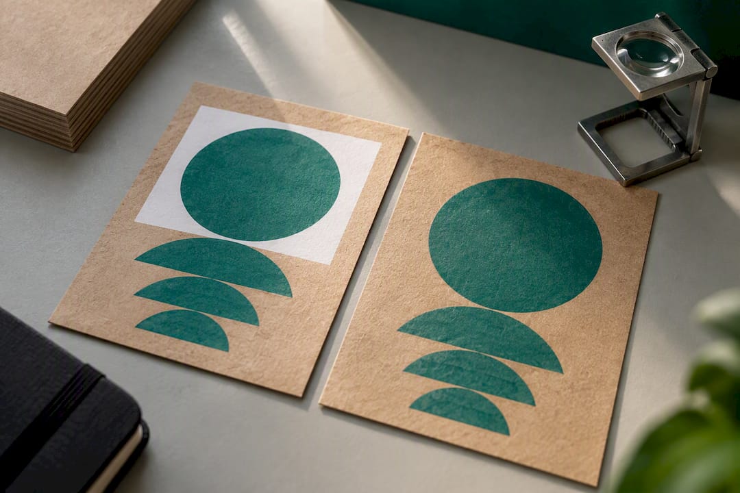
The fastest way to a happy result on kraft is designing for the substrate rather than fighting it. Bold solids, simplified logo marks, and deep neutral colors like black, navy, burgundy, and forest green reproduce cleanly on kraft with minimal shift, because dense, saturated ink holds its own against the brown base underneath. Delicate halftones, pastel tints, and light brand colors are the opposite story. They rely on a lot of white space between dots to read as light, and kraft’s brown fill destroys that effect unless a white base sits underneath.
That’s exactly when white underprint earns its cost. Pastels, brand-bright colors like a signature teal or coral, and anything close to true white on the design all need white backing to read correctly. A smart middle ground many brands land on is combining selective white backing under logo or type elements with exposed, unprinted kraft as a design element in its own right, letting the paper’s natural texture do some of the visual work for free.
Finishing options extend what’s possible without touching color fidelity at all:
- Foil stamping adds metallic shine and premium feel in a single hit, with no dot gain concerns.
- Blind embossing creates texture and depth using pressure alone, no ink required.
- Spot gloss varnish adds contrast and shine over specific elements to make a logo pop against a matte kraft field.
Kraft printing guides consistently point to bold, high-contrast artwork as the reliable choice when exact color replication isn’t the priority. One registration warning worth flagging early: any foil or varnish applied near a white underprint edge needs tight registration tolerance, or you’ll see a visible halo where the layers don’t quite line up.
Pro Tip: If your brand palette includes even one pastel or bright accent color, ask your converter for a white-backed strike-off and a non-backed strike-off side by side. Seeing both on the actual kraft grade, in person, makes the underprint decision obvious in a way no screen proof ever will.
Production QA: Locking the Match for Every Reorder
A signed physical sample is the anchor for everything that follows. Once a strike-off matches your approved target within an agreed ΔE tolerance, get it signed, dated, and labeled with the exact kraft grade, grammage, and press conditions used to produce it. That sample becomes the master reference for every future reorder, not the digital proof on a screen.
The recommended path from first sample to full production:
- Strike-off: a small sample run on the intended kraft grade, measured against your target and adjusted until it holds within tolerance.
- Pilot run: a short production-length run under real press conditions to confirm the match holds at speed and volume, not just on a test press.
- Signed production approval: the buyer signs off on a physical sample from the pilot run, and that sample plus its recorded ΔE tolerance becomes the standing spec.
- Ink recipe retention: the converter keeps the exact formulation on file so every reorder starts from the same base rather than a fresh eye-match.
Paper lot control matters just as much as ink control. Ask your converter to notify you before switching kraft suppliers or lots, since shade and grammage variation between lots is one of the most common causes of a “why doesn’t this look like last time” complaint on reorders.
How Gatherpackaging Handles Pantone Matching on Kraft Bags
Getting a brand color right on kraft comes down to controlling variables most buyers never see: the exact paper grade, the white underbase decision, and whether the ink recipe from the first run is actually saved for the next one. A reliable process specifies kraft grade and basis weight upfront, runs white underbase proofs when a brand color calls for it, and retains ink recipes on file so reorders match the original approval instead of starting from scratch.
That process runs through advanced flexo printing capability, giving room for dedicated spot stations alongside process color when a brand needs both photography and a locked Pantone in the same design. Pre-press proofing and prototyping happen before a full production run, catching color and registration issues on a strike-off rather than on a finished run of bags.
Materials matter too. Manufacturers working with FSC-certified stock and water-based inks note that some finishes, like certain foils or heavy laminate coatings, can affect how recyclable the final bag is, so that trade-off is worth raising during the design conversation rather than after production.
What a Practitioner Wants Designers to Know
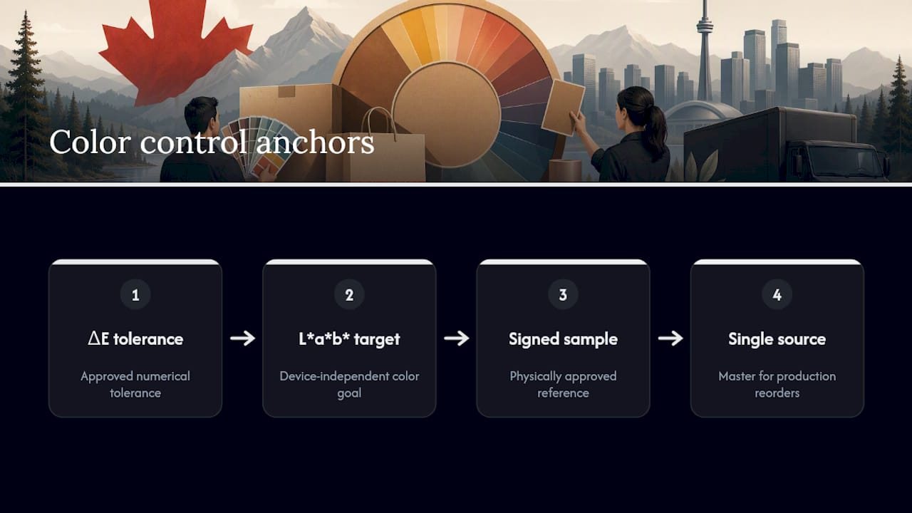
Somebody has to own the color spec, and it should never be left to whoever happens to approve the PDF fastest. On kraft especially, one person, ideally someone with print production experience, should hold the ΔE tolerance, the Lab* target, and the signed sample as the single source of truth. Everyone else works from that, not from a screen.
Realistic timelines matter more than people admit. A strike-off takes real press time to schedule, and rushing that step to hit a launch date is how brands end up approving a color under bad lighting, in a hurry, and regretting it on the full run. Build the strike-off into your calendar the same way you’d build in shipping time. It deserves the same respect.
The best packaging color decisions I’ve seen come from designers who treat the converter’s press floor knowledge as part of the design process, not a constraint applied after the fact.
— Taylor
Ready to Prototype Your Brand Color on Kraft?
A practical alternative to guessing a Pantone match is domestic manufacturing that allows strike-offs and prototypes to move fast, and retention of ink recipes so subsequent orders match the original without renegotiating the color from scratch.
If a specific Pantone or brand color needs to survive the jump to kraft, the fastest way to know for sure is a physical prototype on the actual stock you plan to run, not a screen proof. Gatherpackaging offers prototype strike-offs on your intended kraft paper grade, along with prepress support for layer naming, white underbase decisions, and registration tolerances before a full run gets scheduled. Browse the paper bag styles and finishes available, or reach out directly to talk through your color spec, your timeline, and what a realistic strike-off-to-production schedule looks like for your order.
Sources
For deeper detail beyond this guide, review the PantoneLIVE Eco-Kraft library announcement, flexo plate research on kraft printability, and ink-stability resources like pigment dispersion guidance from formulation specialists. None of it replaces a signed, spectrophotometer-measured sample on your actual kraft grade.
- Digital color matching, repeatable quality, optimized efficiency
- Full-Color Box Printing Without the Guesswork - Easy Box Packaging
FAQ
Can You Print Color on Kraft Paper?
Yes, kraft paper prints in both spot Pantone and CMYK, but the brown substrate darkens and desaturates most colors compared to how they look on white stock. A white underprint or litho-lamination is the standard fix when exact color fidelity matters.
What Is the CMYK Color Code for Kraft Paper?
There isn’t one universal CMYK code for kraft, because kraft shade varies by mill, recycled content, and bleach level. Converters typically match kraft’s background tone visually or by spectrophotometer reading against the specific paper lot in use, rather than relying on a fixed formula.
How Do You Get an Accurate Pantone Color on Kraft?
The most reliable route is a white underprint beneath your Pantone ink, paired with a measurable Lab* or CxF reference and a signed strike-off on the exact kraft grade you’ll run in production. Skipping the white base and measurement step is the most common reason a Pantone match drifts between the proof and the finished bag.
Are Pantone Colors Copyrighted?
Pantone’s specific color formulas and naming system are proprietary and licensed, though individual colors themselves aren’t copyrightable in the way a design or logo would be. Brands generally reference Pantone numbers for communication purposes, while the actual matching and reproduction happens through licensed ink systems like PantoneLIVE or a converter’s own formulation database.
Share:
Paper Bag Shipping Weight: 4 Supplier Numbers Procurement Teams Need
Stop Reprints and Plate Costs for Paper Bag Printing Plates for Buyers