

TL;DR:
- Color management in packaging ensures brand colors are reproduced accurately and consistently across all materials. It relies on numeric standards, substrate validation, calibrated tools, and physical proofs to prevent color drift and maintain shelf presence. Proper discipline and documentation are essential for consistent color quality throughout production.
Color management in packaging is the set of processes and tools designed to ensure that brand colors are reproduced accurately and consistently across all packaging materials, substrates, and print runs. The industry standard for acceptable color variation is a Delta E (ΔE00) ≤ 2.0, with luxury packaging requiring tolerances ≤ 1.0. That gap between 2.0 and 1.0 is the difference between a bag that looks “close enough” and one that looks exactly right on a retail shelf. For packaging professionals and brand managers working with paper shopping bags, getting this right is not optional. Brand color is a recognition signal, and inconsistency erodes consumer trust faster than most teams expect.

The industry term for this discipline is color management, though you will also see it called color control or print color management in production contexts. Both refer to the same coordinated workflow from design file to finished bag.
What is color management in packaging and why does it matter?
Color management in packaging is a controlled, repeatable process. It replaces subjective visual judgment with objective, numeric standards so that your brand’s red looks the same on a kraft paper shopping bag in Toronto as it does on a coated retail bag in New York.
The pre-production color management cycle runs in four steps: defining spectral data standards, producing calibrated contract proofs, verifying press sheets with spectral measurement, and monitoring in-run samples against Delta E thresholds. Each step catches a different category of error before it becomes a costly reprint. Skipping any one of them shifts color control from science back to guesswork.
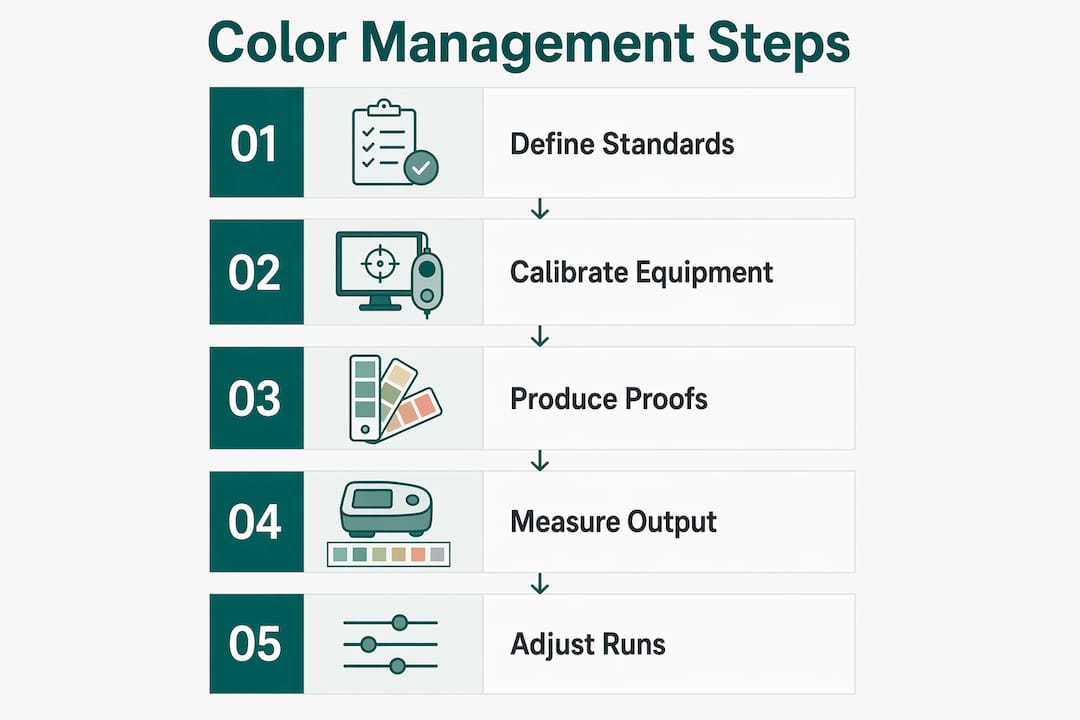
The importance of color management extends beyond aesthetics. A brand color that drifts between production runs signals inconsistency to the consumer, even when they cannot name the exact problem. Retail buyers notice it too, and it creates friction in reorder conversations. Treating color as a mathematical coordinate rather than an artistic preference is the shift that separates brands with consistent shelf presence from those constantly chasing corrections.
What are the key color management techniques used in packaging?
Spot colors vs. CMYK: choosing the right method
Spot colors (PMS) provide higher fidelity than CMYK simulations and should be the default for brand colors on paper shopping bags. CMYK approximations require explicit approval against hard proofs before production begins. The Pantone Matching System gives printers a standardized ink formulation, but it does not control how that ink behaves on a specific substrate or finish. That distinction matters enormously in flexographic printing on paper bags.
ICC profiles address the gap between color intent and printed output. A profile maps how a specific press, ink set, and substrate combination reproduces color, allowing prepress teams to predict and correct shifts before a single bag is printed. Without substrate-specific ICC profiles, color accuracy depends entirely on the press operator’s judgment.
Spectrophotometers and Delta E measurement
Calibrated spectrophotometers measure spectral reflectance during press runs, giving operators a numeric pass/fail signal rather than a visual one. Daily instrument calibration is mandatory for reliable results. A spectrophotometer reading a Delta E of 1.8 on a press sheet tells you exactly where you stand against your approved standard. A human eye looking at the same sheet cannot.
- Define spectral data standards before prepress begins
- Produce calibrated contract proofs tied to the approved color standard
- Verify press sheets with spectral measurement before full runs start
- Monitor in-run samples continuously against Delta E thresholds
Pro Tip: Never describe color to a printer using words like “warmer” or “brighter.” Send numeric color specs in CxF file format with Delta E tolerances written into the purchase order. It removes ambiguity and gives both parties a clear pass/fail standard.
Why does substrate-specific color management matter?
The same Pantone ink looks different on coated white paper, natural kraft, and recycled board. Substrate and finishing variations cause color shifts even when the ink formulation is identical. Absorption rate, surface texture, and base color all alter the final appearance. A brand color approved on coated stock will drift visibly when printed on an uncoated kraft bag without re-validation.
This is why Pantone standardizes inks but cannot control the substrate or finish. Each material requires its own lab-tested color reference. Ink drawdowns, lab dips, and physical Golden Samples must be produced for every substrate in your packaging lineup, not just the primary one.
Sustainability choices introduce additional variables. Recycled content board and FSC-certified kraft paper have natural color variation that affects ink absorption. When Gatherpackaging works with recycled or mono-material substrates, re-validating brand colors against the new material is a required step, not an optional one. The eco-friendly packaging workflow must account for substrate color shifts from the start.
Key substrate-specific practices include:
- Produce ink drawdowns on the actual substrate before approving color
- Create a physical Golden Sample for each material and finish combination
- Re-validate colors whenever the substrate, coating, or finish changes
- Use white underprints on transparent or natural kraft surfaces to maintain color fidelity
- Document substrate-specific ICC profiles separately from your master color library
Pro Tip: When switching from coated to uncoated paper for an eco-friendly bag line, request a new ink drawdown before approving any proofs. The color shift on uncoated stock can be significant enough to require a reformulated ink, not just a press adjustment.
How do lighting conditions affect color approvals in packaging?
Metamerism is the phenomenon where two colors match under one light source but diverge under another. ISO 3664 recommends D50 lighting as the standard viewing condition for packaging color approval. Without a standardized light source, two people looking at the same proof can reach opposite conclusions about whether the color is correct.
D50 viewing booths are the accepted tool for this reason. They replicate the spectral output of average daylight at 5,000 Kelvin, giving brand managers and printers a shared, repeatable reference point. Approving color under office fluorescent lighting or a phone screen is not a valid substitute.
Physical contract proofs and Golden Samples serve as the definitive color standards in production. A Golden Sample is a physically approved reference specimen from a prior production run that all subsequent batches must match. It eliminates the subjective recollection problem that plagues brands relying on digital files alone. Digital soft proofs on calibrated monitors are useful for early-stage review, but they cannot replicate the effect of ink on paper under retail lighting.
- Conduct all color approvals under D50 standardized lighting booths
- Retain physical Golden Samples for every approved colorway and substrate
- Simulate retail shelf lighting during final approval to catch metamerism before production
- Never accept a soft proof as the sole basis for color sign-off
Pro Tip: Request that your printer send physical proofs with the correct finish, whether matte or gloss, before approving color. A gloss coating shifts perceived color saturation enough to invalidate a proof made on uncoated stock. The packaging finishes you choose affect color as much as the ink itself.
What operational practices reduce color errors across production runs?
Consistent color across production runs requires a documented workflow, not individual expertise. The following practices form the operational backbone of reliable color management.
-
Set numeric Delta E tolerances in every purchase order. The industry standard ΔE00 ≤ 2.0 applies to typical retail packaging. Luxury or premium retail bags should specify ≤ 1.0. Writing these thresholds into contracts gives both parties a clear, enforceable standard.
-
Calibrate all devices daily. Spectrophotometers and densitometers must be calibrated before each production session. An uncalibrated instrument produces readings that look authoritative but are unreliable.
-
Implement continuous in-run monitoring. Pulling press samples at the start of a run is not enough. Color can drift as ink viscosity changes with temperature and press speed. Monitoring samples throughout the run catches drift before it affects the full order.
-
Use a Digital Asset Management system for artwork and color master files. Version control on color files prevents the common error of a printer working from an outdated file. One master color file, locked and version-controlled, is the single source of truth.
-
Communicate color specs numerically. Objective numeric standards remove the ambiguity that causes disputes and reprints. CxF files carry spectral data that printers can load directly into their measurement systems.
Poor communication is the most common cause of color disputes in packaging production. Vague instructions like “match the previous run” without a physical Golden Sample or numeric Delta E reference leave too much room for interpretation. The cost of a reprint on a large bag order far exceeds the time spent writing a precise color specification upfront. Reviewing the packaging prototyping process before committing to a full production run is one of the most effective ways to catch color issues early.
Pro Tip: Build a color specification sheet for every SKU in your bag lineup. Include the Pantone reference, Delta E tolerance, approved substrate, finish type, and the Golden Sample batch number. Attach it to every purchase order. It takes 20 minutes to create and prevents hours of dispute resolution.
Key Takeaways
Effective color management in packaging requires numeric standards, substrate-specific validation, calibrated tools, and physical proofs at every stage of production.
| Point | Details |
|---|---|
| Use numeric Delta E tolerances | Set ΔE00 ≤ 2.0 for retail and ≤ 1.0 for luxury bags in every purchase order. |
| Validate color per substrate | Produce ink drawdowns and Golden Samples for each material and finish combination. |
| Standardize lighting for approvals | Use D50 viewing booths for all color sign-offs to eliminate metamerism errors. |
| Calibrate instruments daily | Spectrophotometers and densitometers must be calibrated before every production session. |
| Specify color numerically in writing | Send CxF files and Delta E values to printers; never rely on descriptive language. |
Why color discipline is the most underrated part of packaging production
Most color problems I see in paper bag production trace back to one root cause: the brand team and the printer are not working from the same physical reference. One side has a digital file. The other has a press sheet from six months ago. Neither has a current Golden Sample. The result is a color conversation conducted entirely in subjective language, and it almost always ends in a reprint.
The fix is not expensive software. It is discipline. Requiring a physical proof before approving any new substrate, writing Delta E tolerances into every purchase order, and keeping a current Golden Sample on file for every active SKU costs almost nothing compared to the alternative. What it requires is that someone on the brand team owns the process and does not let shortcuts slide.
Kraft paper and recycled board, which are the substrates we work with most at Gatherpackaging, are particularly unforgiving. Their natural color variation means that a brand color approved on one batch of paper may need adjustment on the next. Building re-validation into the workflow from the start, rather than treating it as an exception, is what separates brands that maintain consistent shelf presence from those that are always reacting to color drift.
The brands that get this right treat color as a specification, not a preference. They send numbers, not adjectives. They keep physical samples, not just digital files. That shift in mindset is the single most effective thing a brand manager can do to protect color consistency across a paper bag program.
— Taylor
Gatherpackaging’s approach to color accuracy in paper bags
Gatherpackaging produces custom printed paper shopping bags with up to 8-color flexo printing, using water-based inks on FSC-certified and recycled substrates. Color accuracy is built into the production process, not added at the end.

Every custom bag order includes substrate-specific color validation, physical proofing, and in-run spectrophotometric monitoring against agreed Delta E tolerances. The team works with brand managers to establish numeric color specifications before production begins, reducing the risk of disputes and reprints. For brands prioritizing sustainability, Gatherpackaging’s eco-friendly paper bag options include recycled and compostable materials with color management protocols matched to each substrate. To discuss your brand’s color requirements and get a custom bag quote, contact Gatherpackaging directly through the custom printed bag catalog.
FAQ
What is the accepted Delta E tolerance for packaging color?
The industry standard is ΔE00 ≤ 2.0 for typical retail packaging. Luxury packaging requires a tighter tolerance of ΔE00 ≤ 1.0.
Why does my brand color look different on kraft paper vs. coated stock?
Substrate absorption, texture, and base color all alter how ink appears on the surface. Each substrate requires its own ink drawdown and approved color reference, even when the Pantone ink formulation is identical.
What is a Golden Sample in packaging color management?
A Golden Sample is a physically approved production specimen that serves as the definitive color benchmark for all future runs. Every subsequent batch must match it within the agreed Delta E tolerance.
Should I use Pantone spot colors or CMYK for my paper shopping bags?
Spot colors (PMS) deliver higher color fidelity and are the preferred choice for brand colors on paper bags. CMYK simulations require explicit approval against hard proofs before production, as they cannot reliably match all Pantone references.
How do I prevent color drift across multiple production runs?
Write numeric Delta E tolerances into every purchase order, retain a current Golden Sample for each SKU, and require in-run spectrophotometric monitoring throughout production. Continuous measurement catches drift before it affects the full order.
Share:
Top 3 torontoselfstorage.com.au Alternatives 2026
The Role of Bag Customization in Branding for Retailers