

Color accuracy in packaging means one thing: the colors on your finished bag, box, or label match your brand standards precisely, every run, every substrate, every supplier. When that match holds, consumers recognize your product instantly. When it slips, even slightly, the brand identity you’ve built erodes faster than most brand managers expect.
The stakes are concrete. Color inconsistency acts as a subconscious quality signal, and consumers read variation as a lack of control. A shopper who picks up two versions of your retail bag and notices the teal is slightly different on each one doesn’t think “printing variance.” They think something is off with the brand. That perception is difficult to reverse.
Two tools sit at the center of managing this: the Pantone Matching System, which gives every color a universal reference number, and Delta E (ΔE), the metric that quantifies how far a printed color deviates from that reference. Together, they turn color from a subjective judgment into a measurable, enforceable standard.
For sustainable paper packaging specifically, color accuracy carries additional weight. Eco-friendly substrates like recycled kraft and FSC®-certified papers behave differently from virgin coated stocks, which means achieving accurate color requires more deliberate process control, not less.
Why color accuracy matters for packaging professionals:
- Protects brand recognition across all retail touchpoints
- Prevents consumer confusion caused by color drift between product lines or packaging components
- Reduces costly reprints and material waste from off-spec production
- Supports supplier compliance through measurable, objective color standards
- Ensures color-driven purchase decisions work in your favor at the shelf level
- Maintains premium brand perception that color inconsistency directly undermines
Table of Contents
- How color accuracy is measured and what standards actually govern it
- What makes consistent color so hard to achieve in production
- How digital color technology closes the gap between spec and press
- Applying color accuracy to sustainable paper packaging
- Gatherpackaging produces paper bags that hold your brand color to spec
- Key Takeaways
How color accuracy is measured and what standards actually govern it
The Pantone Matching System is the industry’s shared language for color. A Pantone number assigned to your brand’s primary color travels through your entire supply chain, from your design team to your printer to your bag manufacturer, giving everyone the same target. Without it, “teal” means something different to every vendor.
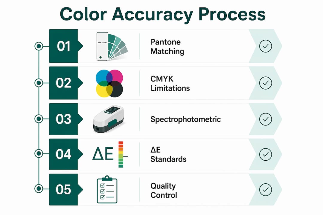
Delta E is how you verify that target was hit. The metric quantifies the perceptible difference between a reference color and a printed result. Brands commonly target tight color tolerances for critical brand colors using the CIEDE2000 formula, with some pushing for even stricter limits particularly for spot colors on high-visibility carry bags.
Key standards and measurement tools used in packaging production:
- Pantone Matching System: Universal color reference for specifying and communicating brand colors across suppliers
- Delta E (CIEDE2000): Quantified color difference metric; lower values mean closer match
- Spectrophotometry: Instrument-based measurement that removes subjective human judgment from color approval
- Lab color space:* Device-independent coordinate system used to communicate color values across the supply chain
- CxF files: Digital color data format that carries full spectral information between design, prepress, and press
CMYK has real limitations here. It’s a four-ink process that cannot reproduce every Pantone color, particularly saturated brand colors in the orange, green, and violet ranges. When a brand color falls outside the CMYK gamut, printers must use spot inks mixed to a Pantone formula. Flexographic printing, which Gatherpackaging uses for paper shopping bags, relies on exactly this approach.
Color tolerance benchmarks by application:
| Color Type | Typical ΔE Target | Application |
|---|---|---|
| Primary brand color | ≤ 2 | Retail carry bags, primary packaging |
| Secondary brand color | ≤ 2 | Tags, tissue, secondary components |
| Process color (CMYK) | — | Non-critical background elements |
| Spot color on uncoated stock | ≤ 2 | Kraft and recycled paper substrates |
Spectrophotometric measurement is the only reliable way to enforce these tolerances. Visual checks are subjective — two operators on different shifts will approve different results, and color matching accuracy differs from one operator to the next, making consistency almost impossible without instrumented verification.
What makes consistent color so hard to achieve in production
Substrate is the first variable that trips up even experienced print buyers. A Pantone color mixed for coated white paper will look warmer and deeper on natural kraft, and lighter on a recycled sheet with visible fiber content. A color accurate on one substrate may appear warmer or deeper on another, which is why substrate-specific ink formulation matters more than most brand managers realize.

Printing press variables compound the problem. Anilox cell volume, ink viscosity, press speed, and plate pressure all shift the final color result. In flexographic printing, even the same Pantone formula will produce different results depending on the anilox roll selected for a given print effect. A flood-coated logo panel and fine-line text on the same bag may require different ink recipes to hit the same visual target.
Common challenges in maintaining color consistency:
- Substrate variation: paper weight, surface treatment, and recycled fiber content all affect ink absorption
- Press-to-press variability across different machines or facilities
- Operator-dependent visual matching with no objective reference
- Lighting conditions during approval: color evaluated under fluorescent warehouse light looks different under retail LED
- Isolated component approvals that miss cumulative drift across a full packaging suite
- Ink batch variation between production runs
Lighting deserves more attention than it typically gets. Color evaluations must use a standardized viewing environment, typically a D50 or D65 light booth, to produce results that translate to the retail shelf. Approving a bag sample under office fluorescents and then seeing it under a store’s warm LED track lighting is a reliable way to generate a complaint.
The cumulative drift problem is particularly damaging for brands with multiple SKUs. Reviewing all packaging components together under controlled conditions prevents the kind of on-shelf variation that makes a product line look like it came from different companies.
Pro Tip: Don’t approve packaging components in isolation. Pull your bags, tissue, tags, and any secondary packaging together under a D50 light booth before signing off. What looks fine individually often reveals noticeable drift when viewed as a complete brand presentation.
How digital color technology closes the gap between spec and press
Manual ink matching is expensive and inconsistent. Operators often lose significant press hours per day trying to reach color targets using trial-and-error methods with a Pantone formula guide and visual comparison. That idle press time translates directly to cost, and the results still vary by operator and shift.

Digital color management replaces that guesswork with a controlled, repeatable process. Cloud-based ink formulation databases, like those that accept spectrophotometric scans and output substrate-specific recipes, can generate an accurate ink formulation at the first attempt. The database accounts for the substrate, ink set, and anilox cell count simultaneously, rather than treating each variable separately.
Digital tools and their role in packaging color accuracy:
- Spectrophotometers: Measure printed color against reference and generate Lab* data for objective comparison
- Cloud-based ink formulation databases: Translate color targets into press-ready recipes for specific substrate and ink combinations
- ICC profiles and color management software: Standardize color behavior across different devices and printing systems
- Digital proofing systems: Simulate press output before production to catch color problems early
- Automated ink dispensing: Connects formulation databases directly to ink mixing equipment, removing manual measurement error
The efficiency gains from this approach are real. Implementing digital color workflows can reduce setup time by 75% and waste by 40% compared to manual matching methods. For a paper bag manufacturer running multiple brand colors across multiple SKUs, that reduction in startup waste and press downtime is significant.
Digital proofing also catches substrate-specific problems before ink hits paper. A color that renders correctly on a coated proof may shift on a recycled kraft bag. Running a substrate-specific digital proof surfaces that shift before a production run is committed.
Applying color accuracy to sustainable paper packaging
Eco-friendly paper substrates present specific color challenges. Recycled content introduces visible fiber and surface variation that affects how ink sits and how color reads. FSC®-certified papers vary in brightness and surface smoothness depending on the mill and grade. These aren’t reasons to avoid sustainable materials; they’re reasons to engineer color specifications that account for them from the start.
Gatherpackaging’s domestic manufacturing in Toronto means color specifications, press proofs, and quality approvals happen within a single, controlled production environment. That proximity matters. When a color question arises mid-run, it gets resolved in hours, not across time zones. The bag printing process uses 8-color flexo printing, which gives brand teams the gamut range to reproduce complex brand palettes accurately, including spot colors that CMYK alone cannot hit.
Accurate color on sustainable paper packaging requires treating substrate effects as a technical parameter, not an afterthought. Ink formulations developed specifically for each paper grade and press configuration reduce manual adjustments and scrap, while spectrophotometric verification at key production stages confirms the result matches the brand standard before bags ship.
Best practices for color management in sustainable paper bag production:
- Specify Pantone colors with substrate-specific notes in your brand standards document
- Request press proofs on the actual production substrate before approving a new bag design
- Define ΔE tolerances in your purchase order, not just in a verbal conversation
- Review all packaging components together under standardized lighting before final approval
- Use color management documentation to maintain consistent specifications across repeat orders
- Confirm that any material change, such as switching to a higher recycled content paper, triggers a color revalidation
Consumer perception reinforces why this discipline matters. Packaging color saturation influences consumer perceptions of product potency and quality, and consumers make purchase decisions within seconds based on color cues. A bag that prints slightly duller than your brand standard doesn’t just look off. It signals a less potent, less premium product before the customer has touched what’s inside.
Gatherpackaging produces paper bags that hold your brand color to spec
Color accuracy in paper shopping bags isn’t a finishing detail. It’s a production discipline that starts with substrate selection and runs through ink formulation, press setup, and final quality verification. Gatherpackaging’s eco-friendly paper bag line is built around FSC®-certified and recycled materials, with 8-color flexo printing that gives retail brands the color range they need without sacrificing environmental standards.
Domestic manufacturing in Toronto means shorter lead times, tighter quality control, and direct communication with the production team when color specifications need to be confirmed or adjusted. For brands that have dealt with offshore color drift and reprints, that control is a concrete operational advantage. Gatherpackaging’s custom printed paper bags are available in multiple styles, including turn top, serrated top, and tamper-resistant formats, all customizable to your brand’s exact color standards.
Contact Gatherpackaging to discuss your paper shopping bag requirements and get a production-ready color plan for your next order.
Key Takeaways
Color accuracy in packaging requires objective measurement standards, substrate-specific ink engineering, and integrated quality approval processes to protect brand integrity across every production run.
| Point | Details |
|---|---|
| Delta E is the enforcing metric | Brands commonly target ΔE00 ≤ 2 for critical colors; tighter tolerances (≤ 2) apply to primary brand colors on retail bags. |
| Substrate drives color outcome | Paper grade, recycled fiber content, and surface treatment all shift how a Pantone color reads; eco substrates require substrate-specific ink formulation. |
| Digital workflows cut waste | Digital color management can significantly reduce press setup time and material waste compared to manual trial-and-error matching methods. |
| Review components together | Approving bags, tags, and secondary packaging in isolation misses cumulative color drift that harms on-shelf brand cohesion. |
| Gatherpackaging | Domestic 8-color flexo production on FSC®-certified and recycled paper, with direct quality oversight and short lead times for retail brands. |
Share:
Styles of Reusable Bags: A Retail Buyer's Guide
What Is Bulk Packaging for Custom Paper Shopping Bags?