
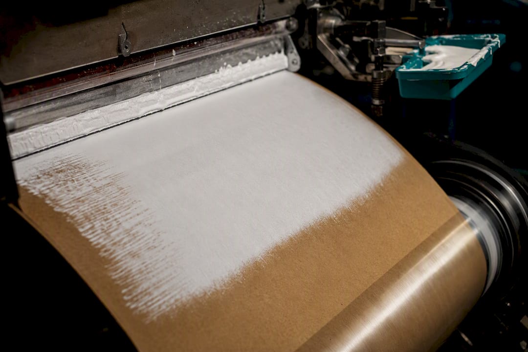
Yes, you can print white on kraft paper, but it takes opaque white ink and a deliberate press setup, not standard CMYK. Expect one of three approaches: a white underprint (a base layer beneath your colors), a spot white for isolated graphics, or a white overprint on top of other ink. Whichever you choose, proof it on your actual kraft stock, budget for an added press station, and plan a short prototyping stage before committing to a production run.
TL;DR:
- White ink requires a dedicated press station and careful setup, including proofing on actual kraft stock, to ensure accurate color and opacity.
- White can be applied as an underprint, overprint, or flood coat, with underprinting yielding the most saturated and true colors on kraft paper.
- Bright white ink on unbleached kraft appears warmer and slightly transparent unless a high-density white or primer is used, while bleached kraft provides better contrast.
- Short runs and prototyping benefit from digital presses with dedicated white channels, whereas larger volumes favor flexo or offset processes with white applied as a separate pass.
- Final quality depends on controlling opacity, edge detail, and resistance, with physical swatches and batch matching essential for consistent results.
Table of Contents
- Why White Ink on Kraft Paper Behaves Differently Than CMYK
- Which Printing Methods Support White Ink on Kraft?
- Does Kraft Grade Change How White Ink Looks?
- How Should You Set Up Files for White Ink on Kraft?
- When Is White Ink Worth the Extra Cost?
- What Should You Check Before Approving a White Ink Run?
- Gather Packaging’s Take on White Ink for Kraft Bags
- Get Custom Kraft Bags With White Ink Done Right
- Sources
Why White Ink on Kraft Paper Behaves Differently Than CMYK
CMYK printing works by letting light bounce off the substrate itself. On white paper, that’s fine, because the paper does the work of reflecting light back through translucent cyan, magenta, yellow, and black inks. Kraft paper doesn’t cooperate. Its brown, fibrous surface absorbs light rather than reflecting it, so any color printed straight onto it inherits a muddy, brownish cast.
White ink solves that problem by putting an opaque layer between the kraft and your artwork. That opacity comes from pigments like titanium dioxide, packed at a much higher density than standard process inks. That heavier pigment load changes how the ink behaves on press: it’s more viscous, it dries or cures more slowly, and it typically needs its own dedicated station rather than sharing a unit with another color.
Where that white layer sits matters just as much as whether it’s there:
- Underprint — white goes down first, as a base coat, and your CMYK graphics print on top. This gives the most accurate, saturated color reproduction.
- Overprint — white prints last, often used for a single graphic element (a logo, a highlight) meant to sit visibly on top of the kraft or other ink.
- Flood coat — white covers the entire sheet or panel, essentially converting a section of kraft into a white surface for full-color printing.
Big Systems notes that underprinting is the standard method for reproducing accurate color on any colored substrate, kraft included. It’s also worth knowing that most desktop laser and inkjet printers can’t do any of this. As SlashGear points out, those machines are built as CMYK-only devices and simply lack the hardware to handle a pigment-heavy white channel.
Which Printing Methods Support White Ink on Kraft?
Not every press can lay down white, and the method you pick shapes both your budget and your turnaround. Digital and analog routes handle it in fundamentally different ways.
Digital presses with dedicated white channels, like Kodak’s NexPress platform or Mimaki’s wide-format lineup, are built for short runs and prototyping. Kodak’s opaque white dry ink can be applied as a flood coat, image coat, or auto white blend, and it’s configured as a spot color right in your design file. Mimaki’s systems lean on ink circulation and faster curing to keep white ink from settling or clogging, which used to be a chronic headache with earlier white-ink hardware.
Flexo and offset workflows are the better fit for larger production volumes, including corrugated and heavier kraft board. Here, white is typically applied as either a flood coat or a spot pass at a dedicated station before the sheet moves to CMYK.
A few operational realities apply across the board:
- White ink adds a press station, which adds setup time and cost.
- Ink circulation systems need regular maintenance to prevent the heavy pigment from settling.
- Flash-curing the white layer before adding CMYK on top prevents the two layers from bleeding into each other.
Curious how flexo stacks up against offset for your specific run size? Our breakdown of flexo vs offset printing covers that trade-off in more depth.
Does Kraft Grade Change How White Ink Looks?
It does, and this is where a lot of projects go sideways. Unbleached brown kraft absorbs more light and shows more visible fiber texture, so white ink on it can look slightly warm or semi-opaque unless you specify a high-density white or add a primer coat. Bleached, or “white,” kraft starts from a lighter base, so white ink sits with better contrast and truer color underneath it. If your brand palette leans on pastels or precise Pantone matches, that difference is not cosmetic. It’s the difference between a proof that matches your brand guide and one that doesn’t.
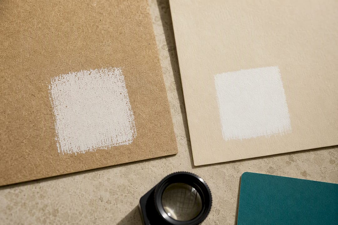
Porosity is the other variable procurement teams tend to underestimate. Kraft paper is a natural fiber product, and its porosity and moisture content vary sheet to sheet and even season to season, since paper mills adjust processing based on humidity and fiber source. That variance can make an identical white ink formulation look slightly more or less opaque from one production batch to the next.
A few practical notes worth building into your spec:
- Coatings or primers can improve white ink adhesion on porous kraft, but check their impact on recyclability before you commit.
- Recycled kraft handles white ink acceptably in most commercial applications, though opacity can trail slightly behind virgin fiber stock.
- Locking your mill, caliper, and coating spec at the outset reduces batch-to-batch surprises once production scales up.
Our kraft paper grades guide walks through the print receptivity differences between bleached and unbleached stock in more detail.
How Should You Set Up Files for White Ink on Kraft?
Prepress mistakes are the single biggest reason white ink jobs come back looking wrong, and almost all of them are avoidable with the right file setup. Here’s the sequence that keeps a job on track:
- Build a named spot color for white. Never rely on a process-white or “no ink” swatch. Give it a distinct name like “Spot White” and keep it isolated on its own layer, not merged into your CMYK artwork.
- Decide underprint versus overprint before you design, not after. A white base beneath your colors behaves completely differently from a white graphic sitting on top of finished ink. Mark your intent clearly in the file and in your printer instructions.
- Export using a PDF/X workflow that preserves spot colors. Smartpress documents this as standard practice for presses like HP Indigo, which use a dedicated white ElectroInk channel.
- Avoid hairline strokes in white. Thin white lines tend to break up or vanish on textured kraft. Specify 100% white density for any element that needs to read as solid, and keep minimum stroke weights generous.
- Request a swatch proof on your actual kraft stock, not a generic white paper mockup, and keep the approved physical sample on file as your production reference.
Pro Tip: Send your printer both a digital proof and a physical swatch pulled from the actual kraft roll you’ll be using. Screen previews and even calibrated digital proofs consistently overstate how opaque white will look on a textured, absorbent substrate.
If brand color accuracy is non-negotiable for your packaging, it’s worth reviewing our color management guide before you finalize files.
When Is White Ink Worth the Extra Cost?
White ink isn’t a default spec. It adds a press station, slows throughput slightly, and raises unit cost, so it earns its place on jobs where the visual payoff justifies it, typically pastel brand palettes, premium retail lines, or any design where color fidelity on brown kraft simply isn’t achievable without it.
Run size drives which production route makes sense:
- Short runs and prototypes favor digital presses with dedicated white channels, since there’s no plate cost and changes are fast.
- Larger volumes shift the economics toward flexo or offset, where per-unit ink cost drops as quantity climbs.
- Either way, build in time for proofs and a small test run. White ink jobs typically need a slightly longer setup and QA window than standard CMYK orders.
What Should You Check Before Approving a White Ink Run?
A short checklist prevents most of the surprises that show up after a full run is already printed:
- Confirm opacity and whiteness match your approved swatch, not just a screen proof.
- Check edge crispness on fine detail, since white ink can spread slightly on porous kraft.
- Test rub and crocking resistance, especially on bags that will be handled repeatedly.
- Keep the physical approved sample on file and require your printer to match production output to it, batch after batch.
Gather Packaging’s Take on White Ink for Kraft Bags
We recommend white ink when a brand’s palette depends on pastels, when the run size allows for real prototyping, or when color fidelity on kraft is simply non-negotiable for a premium retail look. Domestic flexo capability and in-house design support cut down the back-and-forth on proofs, which matters most when you’re testing white ink for the first time. Coatings and recyclability trade-offs belong in the conversation from the start, not as an afterthought once artwork is finalized.
— Taylor
Get Custom Kraft Bags With White Ink Done Right
Getting white ink right on kraft isn’t a guessing game if you work with a printer that can prototype on your actual stock before committing to a full run. Gatherpackaging manufactures custom paper shopping bags domestically in Toronto, with 8-color flexo printing capability that handles white underprints, spot white graphics, and flood coats depending on what your design needs.

Every project starts with a conversation about your kraft stock, your color goals, and your run size, followed by pre-production swatches so you see exactly how white ink will look before a full batch goes to press. Gatherpackaging works with FSC®-certified materials and water-based inks, and domestic production keeps lead times shorter than importing overseas proofs back and forth. If pastel branding, premium finishes, or precise color matching on kraft are part of your next packaging order, browse our kraft paper bag options and contact Gatherpackaging to scope your project and request a quote.
Sources
For deeper technical reference, see Kodak’s NexPress opaque white ink guide and Mimaki’s white ink printing overview.
Share:
Operator Ready White Underbase: Mesh, 190–220°F Flash and 3 Fabric Test
Cut Migration Risk: Water Based Inks for Packaging Buyers