
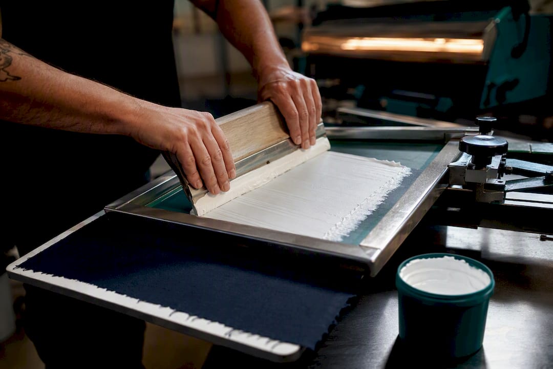
A white ink underbase is an opaque layer printed first to block the garment’s own color, so every ink printed on top reads at full strength and true to its Pantone value. The rule of thumb: if the shirt is darker than medium gray, or the design depends on accurate color, you need one. Screen printing, DTG, and DTF all use the technique, but the mesh, deposit, and cure specifics differ by method.
TL;DR:
- An opaque white underbase is essential for dark garments to ensure true color reproduction and fine detail preservation, especially on black, navy, and maroon fabrics.
- Using a heavy deposit can flatten halftone detail and stiffen the garment, so adjusting the thickness based on the design and fabric is crucial for quality.
- Proper press setup involves selecting mesh between 86 and 110 for full opacity, maintaining tension, and flashing at 190-220°F to prevent issues like poor adhesion or bubbling.
- For non-screen printing methods like DTG and DTF, consistent pretreatment, transfer film quality, and separate curing steps are vital for achieving bright, opaque white layers.
- Conduct thorough testing on multiple fabrics with documented variables before full production to avoid issues like dye bleed, discoloration, or cracking after washes.
Table of Contents
- What a White Underbase Does to Color and Detail
- When You Actually Need an Underbase (and When You Don’t)
- Picking the Right Ink and Setting Up Separations
- Press Settings That Actually Move the Needle
- DTG and DTF: What Changes When There’s No Screen
- Fixing a Bad Underbase: A Step-by-Step Checklist
- A Repeatable Swatch Protocol Before You Commit to Production
- Production Perspective: Why QA Discipline From Packaging Helps Textile Printing
- An Adjacent Option: Printed Packaging and Sample Runs From Gather Packaging
- Sources
What a White Underbase Does to Color and Detail
Dark cotton fibers absorb light and bleed dye into whatever ink sits on top of them. An opaque underbase stops that transfer, sealing the fibers and giving the surface layers something reflective to bounce light off. Print red directly on a navy shirt and you get a muddy maroon. Print the same red over a properly opaqued white base and it reads as red.
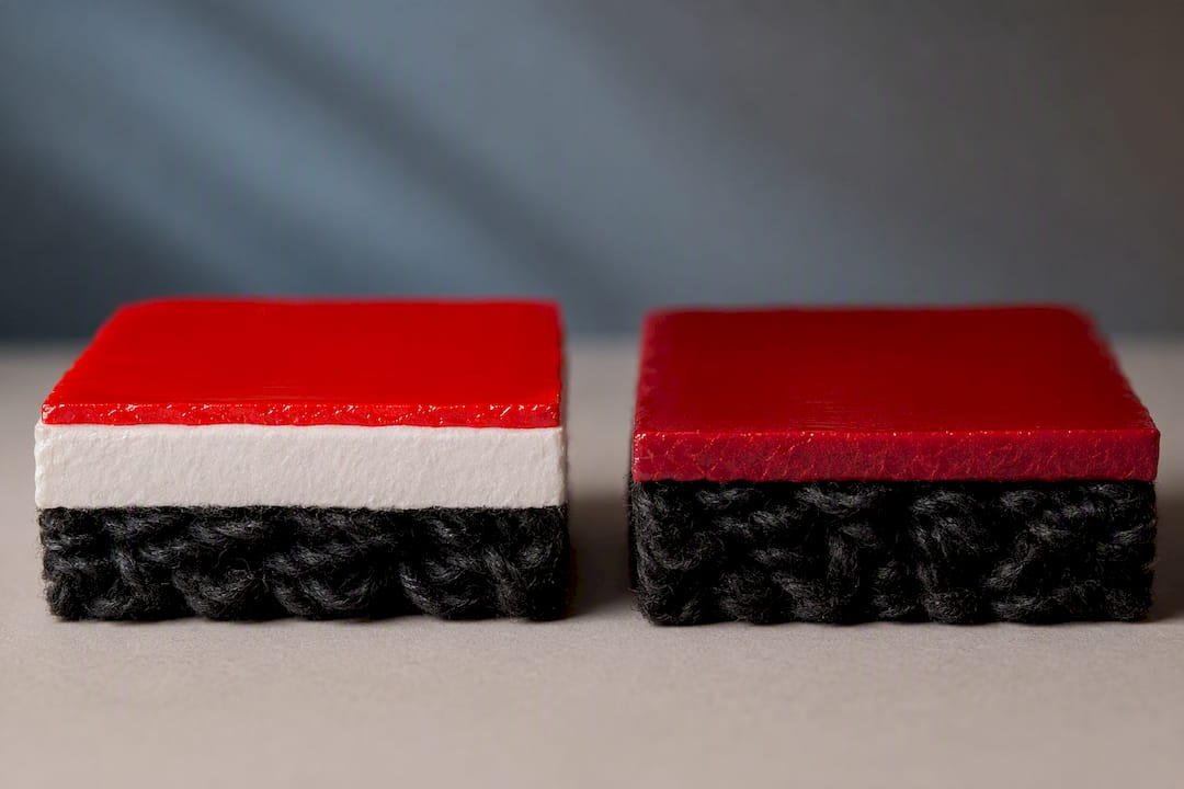
That’s the core mechanism behind every dark-garment print: block first, then color. An underbase is a bright first layer, usually white, printed before other colors specifically to prevent this shift and improve how fine detail holds up in the final image, according to ScreenPrintingNow’s underbase guide.
A few distinctions matter for anyone setting up separations:
- The underbase is a foundation layer, not the finished white. Highlight whites still go on top for crisp pop, since the base itself is meant to gel, not sit as the brightest visible white in the design.
- Heavy underbase deposits can flatten halftone detail and stiffen the garment’s hand, so deposit thickness is a real design tradeoff, not just a coverage number.
- Underbases don’t have to be white. Gray or off-white bases show up in photorealistic and vintage work because they preserve tonal nuance that a pure white base tends to wash out, per Screen Printing Mag’s underbase reporting.
When You Actually Need an Underbase (and When You Don’t)
Not every dark shirt needs a full underbase, and not every job benefits from one. The general trade rule holds that garments darker than medium gray need an underbase for standard plastisol and water-based inks to read correctly, based on guidance from Printable Press’s underbase technique breakdown.
- Use an underbase for multi-color, photo-real, or brand-color-critical designs on black, navy, forest green, or maroon garments.
- Consider discharge printing on 100% cotton when you want a soft hand and can accept some dye-lot variation in the final color.
- Consider specialty direct-to-dark inks when the design is simple and softness matters more than exact color match.
- Watch polyester and tri-blends closely. Dye migration risk is higher on poly-heavy fabric, so a low-bleed or migration-resistant white is often the safer call than a standard high-opacity formula.
Picking the Right Ink and Setting Up Separations
Ink choice and separation strategy do more to determine final quality than almost anything else in the process. High-opacity plastisol gives the strongest one-hit coverage and remains the default for most dark-garment runs. Low-bleed plastisol trades a bit of raw opacity for migration resistance on polyester. Water-based white sits softer on the hand but usually needs more passes to hit full opacity. Discharge base removes the garment’s dye entirely rather than covering it, which only works on reactive-dyed 100% cotton.
- High-opacity plastisol: best all-around choice for cotton and cotton-blend runs needing maximum brightness.
- Low-bleed plastisol: the safer pick for polyester and tri-blends prone to dye migration.
- Water-based white: softer hand, more passes required, better for fashion-weight goods.
- Discharge base: removes dye rather than covering it, limited to reactive-dyed 100% cotton.
For separations, decide early whether you need a full white base or a gray/off-white one. Gray bases hold halftone gradients better on photorealistic art, per Screen Printing Mag. Choke the underbase inward by a small amount so the white layer sits just inside the color art above it and never peeks out along the edges.
Pro Tip: Build your choke into the separation file itself rather than relying on registration to hide it during printing. A choke baked into the art survives operator variation; a choke you’re hoping the press achieves does not.
Press Settings That Actually Move the Needle
Getting a clean, opaque underbase on press comes down to three variables operators control directly: mesh, tension, and heat.
- Pick mesh by deposit, not habit. Use 86 to 110 mesh for heavy, fully opaque underbase deposits, and 130 to 160 for moderate detail work where some halftone survives. Avoid mesh counts above 200 for underbases entirely; they simply can’t lay down enough ink to block dark fabric.
- Check screen tension before every run. Loose mesh distorts under a high-tack white ink and pulls registration off, a problem Screen Printing Mag’s rules for underbase printing flags as a frequent, overlooked cause of misregistration.
- Flood and print with deliberate pressure, keeping ink riding on top of the fabric rather than driving it through the weave, which preserves both opacity and hand.
- Gel the underbase, don’t cure it, before the overprint. Flash at roughly 190 to 220°F (88 to 105°C), just enough to skin the ink so the next layer doesn’t smear into it, according to industry underbase guidance from the Specialty Graphic Imaging Association. Save full cure, typically 275 to 320°F (135 to 160°C) for plastisol, for the finished garment.
Over-flashing is one of the most damaging habits on a production floor. Push the underbase past a gel and into a full cure before the top colors go down, and you risk poor inter-coat adhesion, bubbling, and a stiffer hand than the job called for.
DTG and DTF: What Changes When There’s No Screen
DTG printing lays white ink through inkjet heads rather than a screen, which changes the failure points. Garments need proper pretreatment before the white channel prints, and the printer needs consistent head maintenance and correct ink viscosity or you get banding and weak opacity on a single white pass.
DTF works differently again: white ink prints onto transfer film, not fabric, and gets heat-pressed onto the garment afterward. Density and film compatibility drive brightness here more than anything else, and multiple white passes are often necessary to hit full opacity on dark substrates, per DTF Press Hub’s underbase findings. Both DTG and DTF also typically demand different post-cure handling than screen printing. A screen-printed underbase gels then cures in one press pass; DTG requires a full cure cycle through a heat tunnel or press, and DTF needs a distinct press-and-peel step that screen shops never deal with.
- DTG: nail pretreatment coverage and keep print heads clean to avoid streaky, translucent whites.
- DTF: validate ink density against your specific transfer film before committing to a production run.
- Both: budget for a separate cure step that screen printing doesn’t require.
Fixing a Bad Underbase: A Step-by-Step Checklist
Most underbase problems trace back to one of four causes: deposit thickness, mesh selection, cure profile, or ink chemistry. Work through them in order instead of guessing.
- Pull a control swatch first. Print one small test isolating a single variable, whether that’s ink batch, mesh count, cure temperature, or registration, before touching the production screen.
- Translucent or gray-looking white: increase ink deposit, drop to a coarser mesh, add a second pass, or check that ink viscosity and print head or nozzle condition haven’t drifted.
- Yellowing after cure: review the cure profile for overheating and check ink stability. Some plastisol formulas discolor when pushed past their rated cure window.
- Dye bleed or edge staining: switch to a low-bleed white formula and run a proper dye migration test at your actual production cure temperature, not a guess.
- Cracking after wash: confirm real fusion between the underbase and top layers. Cracking usually means the layers cured as separate films instead of bonding into one.
Pro Tip: If your white looks weak, resist the urge to add reducer. Reducer thins the ink and directly lowers opacity, which is the opposite of what a struggling underbase needs. Mechanical stirring solves viscosity issues without sacrificing coverage.
A Repeatable Swatch Protocol Before You Commit to Production
Run every new ink, garment, or design combination through a standard test before it hits a full production order.
- Print swatches on 100% cotton, 50/50 blend, and 100% polyester side by side.
- Test each fabric at three mesh counts, typically 110, 130, and 160, to see how deposit and detail trade off.
- Log every variable: ink batch, mesh, squeegee durometer, flash time and temperature, final cure time and temperature.
- Wash-test and dye-migration-test each swatch at your planned production cure temperature before locking the recipe.
- File the winning recipe in a swatch library so the next order on that fabric starts from a known-good setup rather than a blank guess.
| Swatch variable | What to record | Why it matters |
|---|---|---|
| Fabric type | Cotton, 50/50, or polyester | Determines migration risk and ink choice |
| Mesh count | 110, 130, or 160 | Controls deposit thickness and detail retention |
| Flash temperature | °F/°C and duration | Prevents over-gel before overprint |
| Final cure | °F/°C and duration | Confirms full fusion without discoloration |
| Wash result | Pass/fail after test wash | Flags dye migration or adhesion failure |
A documented swatch library cuts setup time and rework on every repeat order, a pattern Printable Press points to directly in its production guidance.
Production Perspective: Why QA Discipline From Packaging Helps Textile Printing
Swatch libraries and logged parameters exist for the same reason a proof cycle exists in printed packaging: predictability beats improvisation. Whether it’s ink deposit on a shirt or coverage on a flexo-printed bag, a documented recipe means the third run looks like the first. Brands should demand that discipline from every print partner, textile or packaging.
— Taylor
An Adjacent Option: Printed Packaging and Sample Runs From Gather Packaging
If your brand is dialing in print consistency on garments, the same standard should apply to what carries those garments out the door. Gatherpackaging is the domestic alternative to overseas bag suppliers for retailers who need predictable color and fast turnaround. Our 8-color flexo printing runs through the same kind of proofing discipline described above: documented recipes, controlled cure and ink parameters, and repeatable results order after order.

Design assistance and prototyping come standard, so you can see a physical proof before committing to a full print run. Services relevant to a packaging buyer include:
- Custom paper shopping bags in turn top, serrated top, and tamper-resistant styles
- FSC-certified and recycled substrate options with water-based inks
- Domestic manufacturing in Toronto for shorter lead times than imported stock
- Design support and prototyping before full production
If you want a printed sample to check color and coverage before locking in a bulk order, request a sample and quote through Gather Packaging or explore our made-in-Canada production details to see current lead times.
Sources
- How to Print the Ultimate Underbase - Screen Printing Mag
- Screenprintingnow
- How to Print on Dark Shirts: The Screen Printing Underbase Technique — Printable Press
- DTF White Underbase — Bright whites in color layers | DTF Press Hub
Always confirm gel and cure ranges against your specific ink manufacturer’s datasheet before production.
Share:
Procurement: Cut Lead Times on Bag Security Features With Canadian QA
Avoid Costly Reprints with White Ink on Kraft for Packaging Buyers