
TL;DR:
- Shelf appeal creates a quick emotional and visual impression that influences purchase decisions within three seconds. Effective design utilizes color, contrast, hierarchy, and transparency to stand out and communicate brand identity amid crowded shelves. Real shelf testing and eye tracking data ensure packaging performs optimally, enhancing both visibility and perceived value through sustainable, well-prototyped solutions.
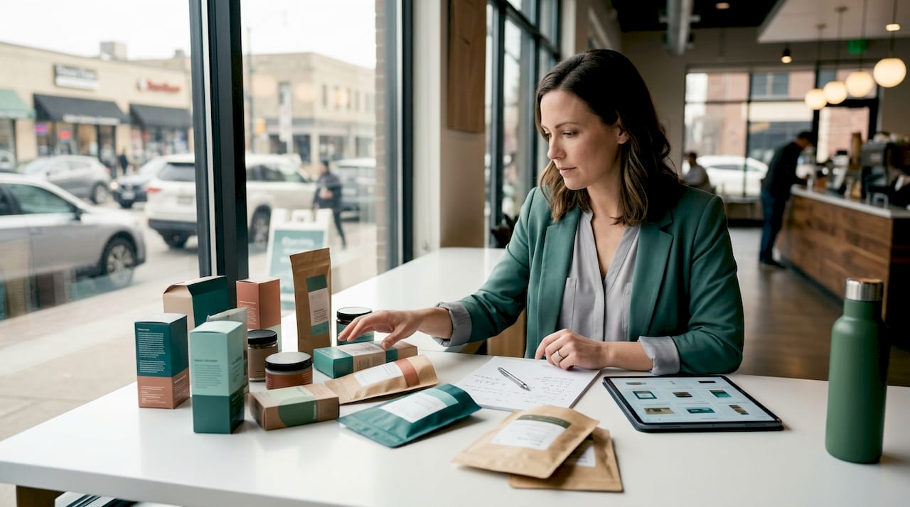
Shelf appeal is defined as the immediate visual and emotional impression packaging creates at the point of purchase, compelling a shopper to stop, notice, and reach for a product. It is distinct from shelf visibility, which simply means being seen. Shelf appeal goes further: it communicates brand identity, product benefit, and quality within roughly 3 seconds. For brand managers and marketing professionals working with paper retail packaging, understanding what drives that impression is the difference between packaging that converts and packaging that gets passed over.
What is the role of shelf appeal in packaging?
Shelf appeal is the decisive factor in retail purchase decisions, and the timeline is shorter than most brand managers assume. Shoppers decide in under 7 seconds at the shelf, making packaging the single most important sales asset at the point of purchase. That window is not enough time to read copy or absorb brand story. It is only enough time to register a visual impression.
The distinction between shelf visibility and shelf appeal matters here. Visibility means your package is physically present and not obscured. Appeal is what happens after a shopper’s eye lands on it. A package can be perfectly positioned at eye level and still fail to convert if the design does not communicate brand, product, and key benefit fast enough. The goal is identification within 3 seconds using contrast, visual hierarchy, and brand consistency working together.
Packaging functions as a silent salesperson. No store associate explains the product. No demo is running. The package itself must do the persuasion work, and it must do it in a crowded visual environment where every competing product is trying to accomplish the same thing. This is why the importance of packaging design is not a creative preference. It is a commercial necessity.
What design elements most influence shelf appeal?
Color is the first signal a shopper processes, and contrast is what makes that signal register against the shelf background. Visual contrast against category norms produces measurably longer fixation duration on packaging. The implication is direct: designing to stand out from the category visual norm, not just from adjacent products, is the more effective strategy.
Several design factors consistently drive shelf appeal across retail categories:
- Color and contrast: Bold, high-contrast palettes that break from category conventions attract attention faster than designs that blend in.
- Visual hierarchy: The most important information, typically brand name, product name, and primary benefit, must be readable at shelf distance without effort.
- Transparency and window elements: Transparent window packaging significantly increases purchase intention, with purchase intent averaging 4.88 versus 3.86 for product-image-only packaging. Shoppers respond to seeing the actual product.
- Structure and shape: Distinctive package shapes communicate differentiation before a shopper reads a single word.
- Tactile finishes: Soft-touch lamination and embossing increase perceived value and willingness to pay a premium. In cosmetic packaging research, consumers paid more for products with soft-touch coatings.
Pro Tip: When reviewing a new packaging design, hold it at arm’s length and give yourself 3 seconds to identify brand, product, and one key benefit. If you cannot do it, neither can a shopper moving through a retail aisle.
Typography is frequently underestimated as a shelf appeal factor. Font weight, size, and spacing determine whether a package reads clearly at 4 to 6 feet. A design that looks polished in a presentation file can become illegible at actual shelf distance. Test at scale, not on screen.

How does consumer behavior research inform shelf appeal optimization?
Eye tracking is the most objective tool available for measuring how shoppers interact with packaging in real environments. Tobii’s wearable and webcam eye tracking methods measure shelf attention shifts and provide data on which design zones attract fixation and which are ignored entirely. This moves packaging decisions from subjective opinion to hypothesis-driven validation.
The key metrics in eye tracking research for packaging include:
- Time to first fixation: How quickly a shopper’s gaze lands on a specific package or design zone. Shorter is better.
- Fixation duration: How long the gaze stays on a zone. Longer duration on the brand or product name indicates effective hierarchy.
- Fixation count: How many times the eye returns to a zone, which signals confusion or interest depending on context.
- Scan path: The sequence in which design elements are noticed, revealing whether visual hierarchy is working as intended.
Eye tracking provides objective evidence of shopper attention beyond consumer recall, making it the most reliable method for data-driven shelf appeal design decisions. — Tobii packaging research
One finding that surprises many brand managers: shoppers scan an entire shelf section in 2 to 7 seconds, and fewer than one-third of category products receive meaningful visual attention. That means the majority of packaging on any given shelf is effectively invisible during a typical shopping pass. The implication is that differentiation from the category’s visual norm is more important than differentiation from the product next to yours.
The limitation of isolated design reviews is significant. A package that looks strong in a presentation deck or on a white background may disappear when placed in a real planogram surrounded by competing products under retail lighting. Shelf-context testing, whether physical or through digital shelf simulation, is the only way to validate that a design actually performs in the environment where it needs to win.
What practical strategies can brand managers apply to improve shelf appeal?
Translating research into production-ready packaging decisions requires a structured approach. The following steps reflect how brand managers and procurement teams can apply shelf appeal principles to paper retail packaging specifically.
- Lead with a single visual statement. The most effective packaging communicates one clear idea. Brand name, product, and primary benefit should be immediately legible. Resist the urge to add secondary messaging to the front panel.
- Build a high-contrast color palette around category differentiation. Audit the color patterns of your category before finalizing a palette. If every competitor uses dark green, a clean white or warm kraft finish may be the stronger differentiator.
- Use structure and finish to signal quality. For paper shopping bags, handle type, bag weight, and surface finish all communicate brand tier before a customer reads anything. A reinforced twisted-paper handle reads differently than a flat ribbon handle.
- Test in shelf context before committing to production. Place physical packaging mockups in a simulated planogram and evaluate at 4 to 6 feet under retail lighting. This step catches legibility and contrast failures that presentation reviews miss.
- Coordinate multiple SKUs for unified shelf presence. When a brand occupies multiple shelf facings, consistent design architecture across SKUs creates a visual block that reads as a brand statement rather than individual products.
- Align sustainability credentials with shelf appeal. Eco-friendly packaging with FSC-certified materials and recycled content is increasingly a reason to buy, not a trade-off against visual impact. Communicating sustainability on-pack adds a purchase driver without sacrificing design.
Pro Tip: Avoid printing sustainability claims in small type on the back panel. If your packaging uses FSC-certified or recycled-content materials, make that visible on the front. Shoppers reward transparency, and it costs nothing extra to position it prominently.
Typography and color consistency across a product line also reduce the cognitive load for repeat shoppers. When a customer can identify your brand from 10 feet away by color and form alone, you have built a shelf presence that works faster than any individual design element.
How does shelf appeal apply to paper shopping bags and eco-friendly retail packaging?
Paper shopping bags occupy a unique position in the retail environment. They function as both packaging and a walking advertisement once a customer leaves the store. The design strategies for shelf appeal that apply to shelf-facing packaging also apply to carry-out bags, but the performance requirements differ.
The table below compares key shelf appeal factors between standard retail shelf packaging and paper shopping bags.
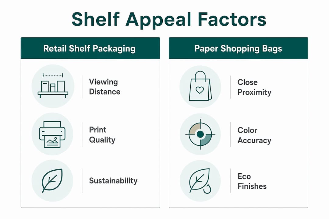
| Factor | Retail shelf packaging | Paper shopping bags |
|---|---|---|
| Primary viewing distance | 4 to 6 feet at shelf | Arm’s length and in-store foot traffic |
| Color vibrancy requirement | High contrast against shelf neighbors | Bold brand color for in-store and street visibility |
| Structural differentiation | Shape, size, and window elements | Handle type, bag weight, and gusset depth |
| Sustainability signaling | On-pack certification marks | Material choice visible by texture and finish |
| Print technology | Varies by substrate | Up to 8-color flexo printing on kraft |
Print quality is the most direct lever brand managers control in paper bag design. Vibrant, accurate color reproduction on kraft or white paper stock communicates brand investment. Gatherpackaging’s 8-color flexo printing capability allows for color depth and consistency that positions paper bags as premium brand touchpoints, not commodity carry-out items.
Eco-friendly finishes present a genuine design challenge. Water-based inks and uncoated kraft surfaces can limit the glossy finish some brands associate with premium appeal. The solution is designing with the material rather than against it. Kraft texture, matte finishes, and natural color palettes can communicate premium quality and sustainability simultaneously when the design is built around those constraints from the start. Eco-friendly retail packaging done well does not look like a compromise. It looks intentional.
Domestic manufacturing also supports shelf appeal consistency in a way that offshore sourcing cannot always match. Shorter lead times from Gatherpackaging’s Toronto facility mean brands can respond to seasonal campaigns, rebrands, or supply disruptions without running out of on-brand packaging. A store shelf stocked with generic replacement bags is a shelf appeal failure that no design budget can fix after the fact.
Key takeaways
Shelf appeal is the visual and emotional impression packaging creates within 3 seconds, and it is the primary driver of purchase decisions in retail environments.
| Point | Details |
|---|---|
| Shelf appeal vs. visibility | Visibility means being seen; appeal means communicating brand, product, and benefit fast enough to convert. |
| Color and contrast drive attention | Designing against category visual norms produces longer fixation and stronger differentiation than matching competitors. |
| Eye tracking validates design | Metrics like time to first fixation and fixation duration replace subjective opinion with measurable shelf performance data. |
| Test in real shelf context | Designs that perform in presentations can fail in planograms. Shelf simulation testing before production prevents costly errors. |
| Sustainability adds purchase intent | FSC-certified and recycled-content packaging is now a positive purchase driver, not a visual trade-off. |
Where most brands get shelf appeal wrong
I have reviewed a lot of packaging briefs over the years, and the most common failure is not bad design. It is good design tested in the wrong context. A brand team approves a beautiful layout in a conference room, on a white background, at a comfortable viewing distance, and then wonders why it underperforms at retail. The shelf is a hostile environment. Competing colors, inconsistent lighting, and a shopper moving at walking pace are not conditions that forgive marginal contrast or small typography.
The second mistake I see consistently is treating sustainability as a back-panel footnote. Brands that use FSC-certified kraft paper or recycled content and then bury that information in 7-point type are leaving a purchase driver on the table. Shoppers in 2026 respond to visible sustainability credentials. Put them where they can be seen.
What I find genuinely effective is the combination of domestic manufacturing reliability with iterative design testing. When a brand can prototype quickly, test in a real shelf simulation, and reorder on a short lead time, the packaging program becomes responsive rather than static. That responsiveness is what keeps shelf appeal consistent across seasons and SKUs, not just at launch.
Packaging is also a brand touchpoint that extends well past the shelf. The bag a customer carries out of your store is seen by everyone they pass. That post-purchase visibility is an extension of shelf appeal, and it deserves the same design discipline.
— Taylor
How Gatherpackaging helps brands achieve shelf appeal with paper packaging
Gatherpackaging manufactures custom printed kraft paper shopping bags from its Toronto facility, giving retail brands and marketing teams direct access to eco-friendly paper bags that combine strong shelf presence with FSC-certified sustainability credentials. With 8-color flexo printing, multiple bag styles, and domestic production that supports short lead times, Gatherpackaging helps brands maintain consistent, on-brand packaging without the supply uncertainty of offshore sourcing.

If your brand is reviewing its retail packaging program or preparing for a seasonal campaign, contact Gatherpackaging to discuss custom kraft paper bags built for both shelf appeal and sustainable retail. The team offers design assistance, prototyping, and quality assurance from brief to delivery.
FAQ
What is shelf appeal in packaging?
Shelf appeal is the visual and emotional impression packaging creates at the point of purchase, communicating brand identity, product, and key benefit within approximately 3 seconds. It is distinct from shelf visibility, which simply means the package is physically present and unobstructed.
How does color impact shelf appeal?
Color is the first signal shoppers process, and contrast against category visual norms produces measurably longer fixation on packaging. High-contrast palettes that break from category conventions attract attention faster than designs that blend with competitors.
Why is eye tracking useful for packaging design?
Eye tracking measures time to first fixation, fixation duration, and scan paths to provide objective data on how shoppers interact with packaging at shelf. Tobii’s eye tracking tools replace subjective design opinions with measurable performance evidence.
Does sustainable packaging hurt shelf appeal?
Eco-friendly packaging using FSC-certified materials and recycled content is increasingly a purchase driver rather than a visual compromise. Sustainability credentials communicated prominently on-pack add a reason to buy without sacrificing design impact.
How does transparent packaging affect purchase intention?
Transparent window packaging increases purchase intention significantly, with intent averaging 4.88 versus 3.86 for product-image-only conditions. Shoppers respond to seeing the actual product, which functions as both an intrinsic and extrinsic quality cue.
Share:
Creative Packaging Finishes That Build Stronger Retail Brands
FSC-Certified Packaging Guide for Buyers in 2026