
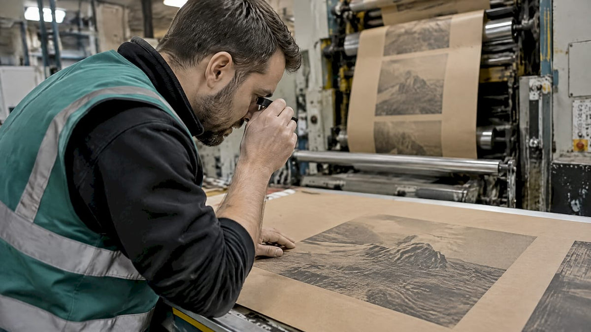
You can print halftones on kraft, but the single control that determines whether the job looks right is prepress dot-gain compensation paired with a conservative screen frequency. Before plates go out, run a scrap test on the actual stock and capture a tone value increase (TVI) curve. That one step prevents most of the reprints and color complaints that come from printing on an uncoated, absorbent surface.
TL;DR:
- Running a scrap test on the actual kraft stock and capturing a tone value increase curve is essential to prevent reprints and color issues.
- A screen frequency of 45 to 85 LPI suits flexo on kraft, while sheetfed offset can achieve up to 133 LPI on smoother surfaces, with AM screening preferred.
- Smoother, lower-recycled kraft holds dots better, whereas rougher or high-recycled paper causes dot spread and contrast loss, especially in midtones.
- Measure the actual TVI curve on the press and stock and build a plate compensation curve to ensure consistent dot size before printing full runs.
- Proper press setup, including ink film thickness, anilox choice, and impression pressure, is crucial for controlling dot gain and maintaining halftone quality.
Table of Contents
- Recommended halftone settings and screening choices for kraft
- Substrate selection and paper grade shape halftone outcomes
- Artwork prep and plate compensation before you send files
- Press setup, inks and anilox choices that control dot gain
- Proofing and test-run checklist before approval
- Finishing and handling after the print is right
- Gather Packaging: how our manufacturing and QA reduce halftone risk on kraft
- Dot gain and TVI behavior on uncoated kraft
- Trade-offs worth making on packaging runs
- Request a kraft halftone proof from us
- FAQ
- Sources
Recommended halftone settings and screening choices for kraft
Kraft absorbs ink differently than coated stock, so your screen choices need to account for a surface that spreads dots rather than holding them crisp. The right frequency depends on the process, not a universal number.
- Flexo: 45 to 85 LPI is a realistic working band for most kraft shopping bag runs, with the lower end reserved for rougher or recycled stock.
- Sheetfed offset: 60 to 133 LPI is achievable, but the top of that range only works on smoother, better-formed kraft and a press and plate system proven to hold fine dots.
- Screening type: AM (conventional dot) screening tolerates kraft’s texture better than FM or stochastic screening, which demands tighter ink transfer control that porous kraft struggles to deliver.
- Dot shape: round or elliptical dots hold up better than square dots through the midtones, where square dot corners touch early and cause visible jumps around 50% coverage.
The practical rule is to screen at the highest frequency your press, anilox, and plate system reproduce consistently, not the highest the art file could theoretically support. Pushing LPI past what the production chain can hold just moves the problem from the file to the press.
Substrate selection and paper grade shape halftone outcomes
Not all kraft behaves the same way under a halftone. Smoother, more calendared kraft holds dot edges better because ink sits closer to the surface instead of wicking into open fiber. Rougher, high-recycled-content kraft spreads ink into the paper structure, which enlarges dots and softens contrast, an effect well documented on uncoated, porous substrates where ink penetrates the fiber pores and causes dot spread, with midtones affected most.
When specifying stock for a halftone-heavy design, ask your supplier for:
- A smoother surface finish and lower roughness rating, even within a kraft grade.
- A GSM and caliper suited to the bag style, since thinner sheets can show print-through on reverse-side graphics.
- Clarity on recycled content, since higher recycled fiber tends to open the sheet structure and increase absorption.
Our kraft paper grades guide breaks down the common grade options and what each one tends to do with fine print detail.
Artwork prep and plate compensation before you send files
The gap between what looks right on screen and what prints on kraft gets closed in prepress, not on press. A few steps make that gap predictable instead of a surprise at make-ready.
- Measure a TVI curve on the actual kraft stock and press combination you will run, using SCTV where the job involves spot colors, since SCTV measurement creates more visually uniform tonal spacing/t200187.pdf?sfvrsn=b90b4cff_2) than a simple Murray-Davies reading alone.
- Build a Natural Plate Compensation (NPC) curve from that measurement and document it in the job ticket so the imaged plate values match the optical dot areas you actually want on the sheet.
- Check the file for minimum printable dot size, highlight bumping, screening angle conflicts, and trapping before it goes to the RIP.
- Send your measured compensation to the press house, or request theirs, and agree on a test print before committing to full plates.
Our overprint versus knockout preflight guide covers related file checks worth running alongside your compensation curve.
Pro Tip: Ask your printer for their house NPC curve on kraft before building your own, since a curve measured on their specific press and anilox combination will outperform a generic compensation value every time.
Press setup, inks and anilox choices that control dot gain
The press side of the job is where ink formulation and metering decide whether your compensation curve holds up. Ink tack and pigment strength matter because a film that is too heavy over-delivers into the dot shoulders, while one that is too thin starves the highlights.
- Ink film thickness: running an appropriate thickness, rather than the thickest ink the press will tolerate, improves trapping and keeps dot edges sharper, a trade-off well documented in sheetfed offset gray-balance work.
- Anilox selection: a higher ruling and lower cell volume reduces over-delivery onto a porous surface; test a few cell volumes on scrap kraft before locking the production roll.
- Impression and plate hardness: softer flexo plates or overly aggressive impression pressure both push more ink into the sheet than the dot needs, so register and pressure checks belong in every make-ready.
- FM/stochastic screening: the finer, randomized dot structure demands tighter transfer control than most kraft runs can deliver consistently, so AM screening remains the safer default.
Our flexo versus offset guide walks through how each process handles these variables differently.
Pro Tip: If banding appears near midtone coverage, check screen angle and line frequency settings first, as checkerboard patterns at these tonal values are commonly caused by resolution or angle mismatches rather than ink or press issues.
Proofing and test-run checklist before approval
A disciplined proofing sequence catches problems while they are still cheap to fix.
- Run incremental make-ready proofs across a full tonal range, including dedicated 50% midtone patches, and inspect dot edges under a loupe.
- Measure TVI on the printed patches and compare the result against your plate compensation target, noting any deviation in the job ticket.
- Check for banding, dot deformation, and registration drift, and reprint any finished samples through varnish or laminate to confirm the finish does not distort the tonal read.
- Keep a signed physical proof or a documented digital record as the standard any reorder gets measured against.
Finishing and handling after the print is right
Finishing choices can protect a good halftone or quietly undo one. Aqueous coatings and laminates change surface gloss and contrast, so test coated and uncoated samples side by side before locking a finish. Avoid placing fine halftone detail across a fold or score line, since repeated flexing there distorts dots faster than it does solid ink. A light matte aqueous coating tends to preserve dot structure better than a heavy gloss layer, which can visually flatten contrast in the midtones.
Gather Packaging: how our manufacturing and QA reduce halftone risk on kraft
We run 8-color flexo with pre-press proofing, prototyping, and quality assurance built into our production line, which lets us test a halftone design on your actual stock before full production. We apply measured plate compensation curves and press tests rather than relying on theoretical dot values, so the proof you approve matches production closely. If you are specifying halftone graphics on a paper bag program, request a sample proof or a production quote through our kraft paper bag page.

Dot gain and TVI behavior on uncoated kraft
Uncoated kraft behaves differently from coated stock at every tonal step, and the difference is largest in the midtones. Ink does not sit flat on an open fiber surface the way it does on a coated sheet; it wicks into pores at the dot edge, so a 50% dot on film can print noticeably larger than 50% on paper. This is the core reason why a compensation curve measured on coated stock cannot be reused for kraft.
The effect is not uniform across the tonal range either. Highlights and shadows typically show smaller shifts than midtones, because a small dot has less perimeter to spread from and a large dot is already near full coverage. That uneven behavior is exactly what a measured TVI curve captures and a theoretical dot-gain percentage misses.
Surface roughness compounds the issue. A rougher kraft sheet gives ink more irregular pore structure to travel through, producing dots that are not just larger but less uniform in shape, which is part of why high-quality halftone reproduction depends on substrate smoothness and why coated papers have historically been preferred for fine screen work. On kraft, the practical response is not to abandon halftones but to screen coarser, measure the real curve, and compensate for it before plates are made rather than after a run comes back wrong.

Trade-offs worth making on packaging runs
A halftone on kraft rarely needs to match a coated-stock proof dot for dot. Giving up a little fine detail for a screen and compensation curve that reproduces reliably saves far more in reprint risk than it costs in visual sharpness. Our proofing process exists to find that balance before full production.
— Taylor
Request a kraft halftone proof from us
We combine flexo printing, pre-press proofing, prototyping, and quality assurance under one roof, which means a halftone design can be tested and adjusted on your actual stock before it reaches full production. If you are specifying a kraft shopping bag with photographic or fine graphic detail, reach out through our product pages to request a sample proof or a packaging consultation.

FAQ
How do you make a halftone for DTF printing?
DTF (direct-to-film) halftones are built in RIP software using screen settings tuned to the film and transfer process rather than to paper, so the frequency and dot gain behavior differ from kraft packaging work. If you are moving a design between DTF and kraft packaging, treat them as separate screening jobs with separate compensation curves.
Can kraft paper go through a standard printer or press?
Kraft runs on flexo and sheetfed offset presses regularly in packaging production, though it needs screening and ink settings suited to an uncoated, more absorbent surface. A desktop inkjet or laser printer can handle light kraft stock for proofs, but production-scale bag printing is done on commercial flexo or offset equipment.
What is the difference between halftone and screentone?
Halftone refers to the broader printing technique of simulating continuous tone with varying dot sizes, a method that dates back to 19th-century printing innovations. Screentone usually refers to a specific patterned sheet or texture style, often associated with illustration and comic art, applied as one type of halftone pattern among several.
How do you reduce dot gain when printing on kraft?
Dot gain on kraft is reduced by measuring a TVI or SCTV curve on the actual stock, building a plate compensation curve from that measurement, and choosing a coarser, press-appropriate LPI rather than the finest screen the file could support. Adjusting anilox ruling, ink film thickness, and impression pressure on press further tightens control once the compensation curve is in place.
Share:
Ink Rub Resistance Checklist for Paper Bag QC: ASTM D5264 & TAPPI T830
330°F, 2–3 min: Water Based Ink Drying for Buyers