
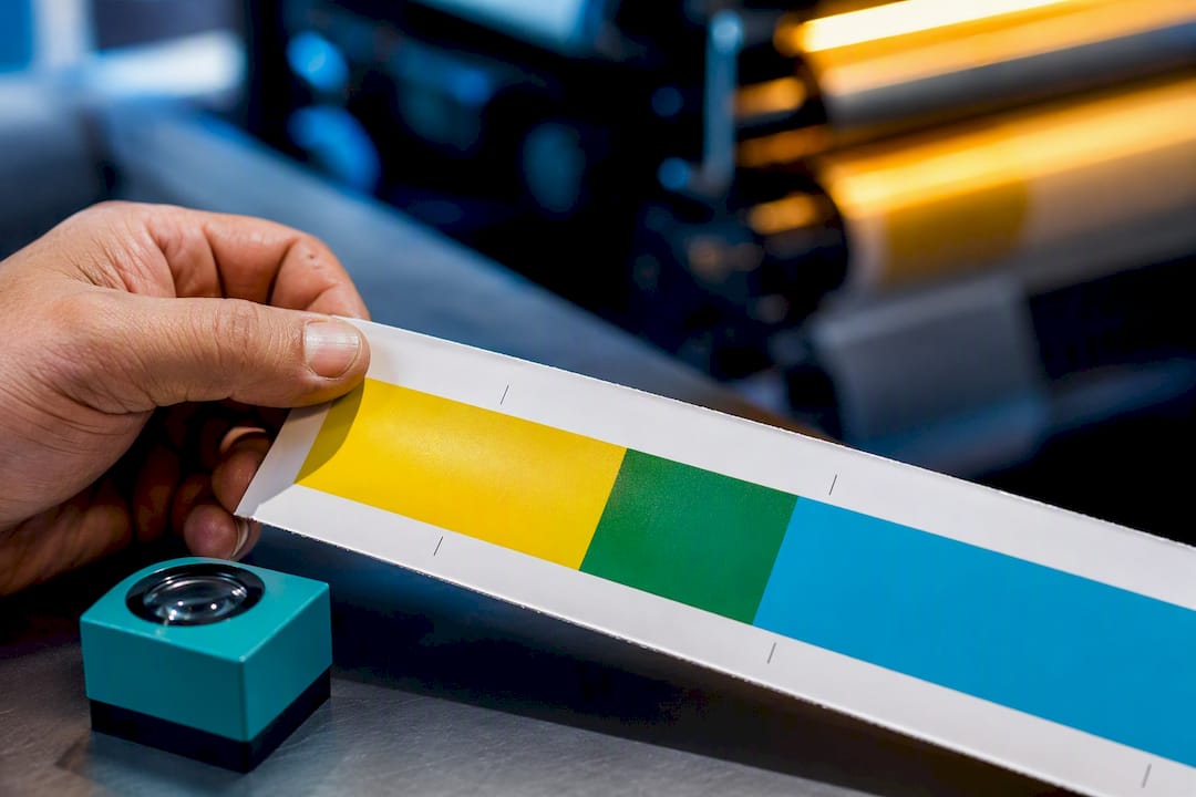
Knockout is the right call whenever color accuracy or white ink matters, since it removes what’s underneath so your fill prints clean. The costliest mistake in packaging prepress: leaving a white ink or Paper swatch set to overprint. It won’t show as a problem on screen. It will simply vanish on press.
TL;DR:
- Overprint often causes color blending issues, producing muddy or unintended hues, especially when used on large solid fills or non-pure black objects.
- Knockout is essential for white ink on dark or metallic substrates, as it replaces the substrate color rather than blending with it.
- Automatic black overprint applies only to objects with exactly 100% black, risking unintentional knockout if black is built as rich black.
- Prior to printing, verifying that all white or paper swatches are set to knockout and checking overprint settings prevents costly reprints.
- Flexo printing’s plate expansion and ink spread demand trapping and thicker strokes for fine details to avoid registration gaps or disappearing reverse elements.
Table of Contents
- Overprint vs Knockout: What Actually Happens on the Press
- When to Use Overprint and When to Use Knockout
- Common Prepress Mistakes That Show Up on Press, Not Screen
- Trapping and What Flexo Printing Demands of Your File
- Your Preflight Checklist Before Sending Files to Print
- Best Practices for Print-Ready Packaging Files
- How We Handle This on Every Bag Order
- Get Your Packaging File Checked Before It Goes to Press
- The Overprint Rule Most Designers Learn the Expensive Way
- Sources
Overprint vs Knockout: What Actually Happens on the Press
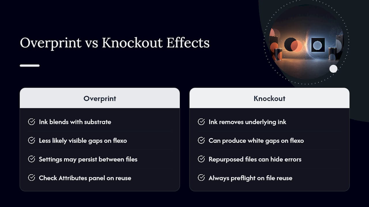
Knockout removes the ink underneath a shape before the top object prints, so your fill lands on bare substrate exactly as designed. Overprint does the opposite: the top ink prints directly on top of whatever’s already there, and the two inks mix on the paper.
That mixing is the whole story. Print cyan over a yellow background with overprint turned on, and you get green, not cyan. On a screen, most PDF viewers simulate this correctly, but the preflight glossary on overprint notes that most objects default to knockout, and overprinting large areas is what usually produces the muddy, unintended color shifts packaging teams complain about after a run is already printed.
Here’s the part that trips people up: what you see in your PDF preview is a simulation, not a guarantee. Screen previews approximate overprint behavior, but the actual press result is final, and substrate color, ink opacity, and press type can all change the outcome. RIPs add another wrinkle. Many are set to auto-overprint black, but only when it’s pure black.
When to Use Overprint and When to Use Knockout
The setting you need depends entirely on what the object is and where it sits in the file. A few rules cover almost every packaging scenario:
- Small black text over a colored background: overprint, but only if the fill is pure K (C0 M0 Y0 K100).
- Spot varnish or coating plates: overprint, since the varnish needs to sit on top of the printed image, not replace it.
- White ink on kraft, dark, or metallic substrates: knockout, always. White needs to replace the substrate color, not blend into it.
- Large solid color fills: knockout, unless you specifically want the layered mixing effect.
The pure-K requirement matters more than most designers realize. RIPs commonly apply automatic black overprint only when the fill reads as exactly C0 M0 Y0 K100. Add even a trace of cyan, magenta, or yellow to build a richer black, and the RIP may treat that rich black as a full color separation instead, which means it could knock out rather than overprint. If you built a logo mark with rich black text on a bag and expected automatic overprint protection, that protection doesn’t apply.
Mark intentional overprints explicitly in Illustrator’s or InDesign’s Attributes panel rather than counting on defaults, and flag every deliberate overprint choice in your notes to the printer. A verbal assumption never survives a file handoff.
Common Prepress Mistakes That Show Up on Press, Not Screen
Most overprint errors are invisible until the substrate is running through the press. That’s the uncomfortable part of this whole topic: your proof looks fine, and the run still fails.
The single most damaging mistake is a white ink or Paper swatch set to overprint. White ink that overprints instead of knocking out becomes functionally invisible, because it’s printing on top of a dark or metallic substrate instead of replacing it as a solid underbase. On a kraft bag with a white logo reversed out of a brown background, that error means the logo simply doesn’t exist on the finished product.
Pro Tip: Search your file’s Attributes panel for any object using a White or Paper swatch, and confirm every single one is set to knockout before you export. This takes two minutes and catches the most expensive error in packaging prepress.
Other recurring failures include:
- Large fills accidentally set to overprint, producing muddy, shifted colors instead of the clean color you designed.
- Registration-driven white gaps at color edges when knockout objects have no trap between them.
- Visible colored fringing where overprint was applied incorrectly to small design elements.
- Composite screen previews that look correct but don’t reflect how separations behave once plates are actually generated.
The gap between what’s intended and what prints usually comes down to designers treating overprint as a visual effect rather than a registration necessity. It’s neither decorative nor optional. It’s a production instruction, and the RIP takes it literally.
Trapping and What Flexo Printing Demands of Your File
Trapping is the deliberate overlap you build between two adjacent colors so a tiny shift in plate registration doesn’t leave a visible gap of bare substrate between them. On flexo presses, where plate expansion and slight ink spread are routine, that gap risk is higher than on offset. Typical trap widths run between 0.1 and 0.3 millimeters, enough to cover minor misregistration without noticeably thickening the design.
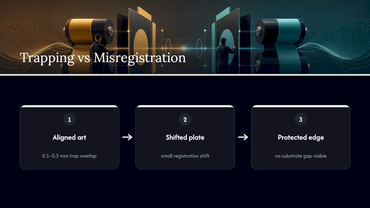
Flexo plates also expand slightly under printing pressure, and ink tends to spread a little wider than the plate image. That means small reverse details, like fine white text knocked out of a dark background, need thicker strokes or a small halo built in, or they’ll fill in and disappear on press. This is a flexo-specific problem; offset and digital printing don’t behave the same way, which is one reason flexo and offset printing produce different results from the same source file.
Pro Tip: Flatten transparency effects and simplify blending modes before you send a file to a flexo printer. Many flexo RIPs don’t process complex transparency reliably*, and a blend mode that looked fine on screen can print as a solid block of the wrong color.*
Your Preflight Checklist Before Sending Files to Print
Run these checks in order, every time, before a packaging file leaves your desk:
- Toggle Overprint Preview. In Acrobat, open Output Preview and enable Simulate Overprinting to see how separations will actually behave, not how the composite screen shows them.
- Audit every White or Paper swatch. Open the Attributes panel in Illustrator or InDesign and confirm nothing critical, especially white ink objects, is set to overprint.
- Confirm your blacks. Check that small text meant to overprint is built as pure 100% K. If it’s a rich black, decide deliberately whether it should knock out or overprint, and set it explicitly.
- Add traps or overprint strokes on reverse text. Thin strokes matching the background color prevent white gaps from appearing at edges.
- Flatten transparency and export PDF/X. Run your printer’s preflight profile before export, since profiles can flag objects still set to overprint Paper or other suspicious overprint settings.
- Request a press proof on your actual substrate. This step matters most on metallics and kraft, where color and opacity behave differently than on a coated proofing stock.
A screen preview only simulates what a RIP will do. Nothing confirms overprint behavior like running Output Preview and checking the Attributes panel before the file ever reaches a plate.
Best Practices for Print-Ready Packaging Files
A short list of habits prevents nearly every overprint-related reprint:
- Knock out white ink every time, without exception.
- Overprint pure K only, and set rich black deliberately.
- Trap adjacent colors before handoff, especially for flexo work.
- Never leave large fills to overprint by default, and never trust an on-screen proof alone.
- Always tell your printer, in writing, which elements are intentionally set to overprint.
| Habit | Correct setting | Why it matters |
|---|---|---|
| White ink on kraft or dark stock | Knockout | Overprint makes white ink invisible on press |
| Small text over color | Overprint (pure K only) | Avoids registration gaps around fine strokes |
| Spot varnish plate | Overprint | Varnish needs to sit on top, not replace the image |
| Large solid fills | Knockout | Prevents unintended color mixing and muddy tones |
| Adjacent color edges (flexo) | Trapped, 0.1–0.3 mm | Covers minor plate misregistration |
Print quality issues like these connect directly to how registration is controlled on press, and the two problems often get diagnosed together when a run comes back wrong. Strong color reproduction is also just good business: as the packaging industry increasingly treats print quality as a direct extension of brand perception, a muddy overprint error on a retail bag isn’t just a technical miss. It’s a customer-facing one.
How We Handle This on Every Bag Order
We flag white underbase settings, flatten transparency, and run a full preflight checklist on every bag file before it touches a plate, because we’ve seen how often an overprint setting slips through unnoticed. That process comes from years of running packaging files through flexo production and catching the errors before they become reprints. If you’re preparing artwork for a bag run, send it our way for a complimentary file review before production starts. It costs you nothing and it catches the mistakes that cost the most.
Get Your Packaging File Checked Before It Goes to Press
Gatherpackaging is the shortcut past the guesswork this whole guide just walked you through. Instead of hoping your overprint and knockout settings survive the jump from screen to substrate, send us the file and we’ll check it as part of our production process, on our own presses, before anything runs.

We manufacture custom paper shopping bags domestically in Toronto, which means your prepress questions get answered by the same team running the flexo press, not a separate vendor three time zones away. That shortens the loop between “is this white ink set correctly?” and an actual answer. Our 8-color flexo printing handles the fine text, trapping, and varnish details this guide covers, and our quality assurance process checks overprint and knockout settings as a standard part of file prep, not an upsell.
If you’re planning a bag order and want your artwork reviewed before it goes to plate, contact Gatherpackaging to start that conversation, or see how our domestic Canadian production keeps lead times short when a fix needs to happen fast.
The Overprint Rule Most Designers Learn the Expensive Way
Overprint and knockout aren’t stylistic choices. They’re structural decisions that determine whether ink physically replaces or blends with what’s underneath it, and treating that decision casually is how good designs turn into expensive reprints.
What surprises most designers coming into packaging work from general graphic design is how much less forgiving flexo is compared to digital or offset. A knockout error that’s barely visible on a digital proof can become a glaring white gap on a flexo-printed kraft bag, because the press itself introduces variables (plate expansion, ink spread, substrate absorption) that a digital printer never has to deal with. The rules in this guide aren’t universal print theory. They’re specific to what happens when ink meets a moving flexo plate under real pressure.
The other pattern worth naming: teams that get burned by an invisible white ink error almost always trace it back to a repurposed file. A logo built for one background gets reused on a darker one, the white element still carries an old overprint setting from a prior version, and nobody checks the Attributes panel because the file “already worked” somewhere else. Overprint settings don’t travel safely between substrates. Every reuse of an existing file deserves a fresh preflight pass, not an assumption that yesterday’s settings still apply.
— Taylor
Share:
Canada Packaging Buyers: Cut EPR Fees with Kraft Bags by May 31, 2026
Procurement: Pilot 3–5 Domestic Paper Bags With Just in Time Packaging