
Use vector art for logos, type, and line work; use high-resolution raster images for photos; and submit a hybrid PDF when a design needs both. That’s the whole decision tree for most paper bag artwork, and getting it backward is the single most common reason a proof comes back with fuzzy edges or a pixelated logo.
Here’s the fast checklist before you send anything to print:
- Keep all text as live vector type, or outline it only at final export.
- Supply logos as native vector files (AI, EPS, or SVG), never as a JPEG pulled off a website.
- Provide photos at the effective PPI your printer requests (check printer specifications), checked at final placed size, not at the size the file happens to be.
- Set color mode to CMYK or the specified spot colors, not RGB.
- Include bleed and trim marks so nothing gets cut off during finishing.
- Embed or properly link every image asset so nothing goes missing during file handoff.
If any of that sounds unfamiliar, contact Gather Packaging, and we’ll review your files and proofs before anything goes to plate.
Key Takeaways
Vector artwork prints reliably at any scale because it holds its edges through resizing and flexo imposition, while raster images need matched resolution to avoid pixelation.
| Point | Details |
|---|---|
| Vector for structure | Use vector for logos, type, dielines, and line art since they must scale without losing sharpness. |
| Raster for photography | Supply photos as high-PPI raster files, sized and checked at their final printed dimensions. |
| Submit hybrid PDF/X | Combine vector and raster elements in one PDF/X file with correct bleed, trim, and CMYK or spot color mode. |
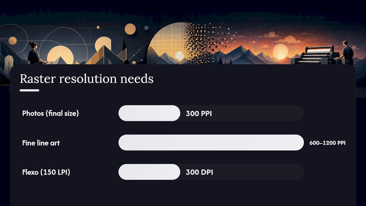
| Match PPI to element type | Use 300 PPI for photos and 600 to 1200 PPI for fine line art or small text at final size. |
| Get proofed before plate | Contact Gather Packaging to have vector and raster files checked in-house before your bag order goes to flexo plate. |
Table of Contents
- Vector vs Raster Printing: The Core Difference
- What a Vector File Is and Why It Prints Crisper
- Vector vs Raster Comparison for Print Decisions
- Which File Format to Use for Each Print Element
- A Print-Ready File Checklist for Bag Artwork
- How to Tell if a File Is Vector or Raster
- Converting Between Vector and Raster: What Works and What Doesn’t
- Common Printing Problems and How to Fix Them
- How Gather Packaging Prepares Vector and Raster Files for Bags
- Why Vector-First Thinking Pays Off on the Production Floor
- Get Your Artwork Reviewed Before It Goes to Plate
- Sources
Vector vs Raster Printing: The Core Difference
A raster file is a grid of colored pixels. Zoom in far enough and you’ll see the individual squares, which is exactly why raster images fall apart when you scale them past their native resolution. Every photograph you’ve ever taken, every scanned image, and every screenshot is raster. Common formats include JPEG, TIFF, PNG, and PSD, and each has a role: JPEG for compressed web images, TIFF for high-resolution print photography, PNG when you need transparency, and PSD when you’re still editing layers in Photoshop.
Resolution, measured in pixels per inch (PPI) or dots per inch (DPI) on the output side, determines how much detail a raster file actually holds at a given size. A photo that looks sharp on a phone screen at 72 PPI can look soft and blocky once it’s blown up to fill a bag panel, because you haven’t added detail, just stretched the same pixels further apart.
Why this matters for printing: raster images excel at continuous-tone photography and subtle shading, things a camera captures naturally, but they carry a hard resolution ceiling. Enlarge past that ceiling and you get visible pixelation, soft edges, or a muddy, low-contrast look on press. Adobe’s comparison of raster and vector formats confirms the tradeoff plainly: raster images lose quality when enlarged, while vector art does not.
As a rough guide for packaging work, photographic images typically need a high PPI at their final printed size, according to PDF Press’s print resolution guide. A photo panel on a 12 inch wide bag needs enough native resolution to hit a high PPI at 12 inches wide, not 300 PPI at the smaller size it was originally shot or cropped for.
What a Vector File Is and Why It Prints Crisper
Vector files don’t store pixels at all. They store mathematical instructions: points connected by curves, filled or stroked with a defined color. Because a curve is described by math rather than a fixed pixel grid, you can scale a vector logo from a business card to a billboard and every edge stays exactly as sharp.
That resolution independence is why vector is the standard for logos, wordmarks, icons, line art, and structural elements like dielines. A dieline (the cut and fold pattern of a bag) has to stay precise at every size and stage of production, and a raster version would introduce rounding errors the moment it’s scaled or rotated during imposition.
Common vector formats include AI (Adobe Illustrator’s native format), EPS (an older but still widely supported exchange format), and SVG (used mostly for web and app graphics). PDF deserves its own mention here, because a PDF isn’t strictly one or the other. Adobe notes that PDFs can contain both vector and raster elements in the same document, which is exactly why PDF has become the standard container for print submission: your dieline and type stay vector, your product photo stays raster, and both travel together in one file.
Pro Tip: Keep the native, editable vector file (the .ai or .eps) archived even after you export a final PDF. Convert fonts to outlines only at the very last export step, never in your working file, so you can still edit copy or swap a headline six months later without hunting down the original font.
Vector vs Raster Comparison for Print Decisions
The differences that matter most on press come down to seven practical dimensions. Here’s how vector and raster stack up against each other for the choices you’ll actually make on a bag order.
| Comparison Dimension | Vector | Raster |
|---|---|---|
| Best for | Logos, type, icons, line art, dielines | Photos, gradients, textured or painted artwork |
| Scalability / resizing | Scales to any size with no quality loss | Fixed resolution; enlarging causes pixelation |
| Resolution / DPI implications | No PPI requirement; renders at device resolution | Needs 300 PPI for photos, 600–1200 PPI for fine line art at final size |
| Color handling | Easily assigned CMYK or spot colors per object | Must be converted to CMYK before export; watch for RGB/LAB shifts |
| File formats / compatibility | AI, EPS, SVG, PDF | JPEG, TIFF, PNG, PSD |
| Editability / workflow | Fully editable paths, text, and colors | Limited to pixel-level edits; text isn’t editable once flattened |
| File size and performance | Small, lightweight files | Larger files, especially at high PPI and large dimensions |
On the printing-process side, Autodesk’s documentation on raster processing explains something that trips up a lot of buyers: vector content prints at the full resolution of the output device, while raster content gets screened according to lines per inch (LPI), a halftone measurement tied to the printing process. For flexo printing specifically, Flexo24’s plate preparation guide recommends calculating resolution as DPI equals LPI times two. At a common 150 LPI flexo screen, that means 300 DPI for your raster images at final size. Vector art skips this calculation entirely because it isn’t screened the same way, which is one more reason to keep as much of a bag design in vector form as the artwork allows.
Which File Format to Use for Each Print Element
Not every panel on a bag needs the same treatment, and trying to force one format onto everything usually causes the problem, not solves it.
Logos and wordmarks: always vector. A brand mark gets reprinted at dozens of sizes over its life, and a raster logo that looked fine at one size will pixelate at another.
Photographic panels: raster, prepared at the target PPI for the panel’s actual printed dimensions. A food photo, a lifestyle shot, or a texture like wood grain or marble needs the continuous tonal range that only raster delivers.
Business cards and small tags: vector, since type and simple graphics dominate and file size stays tiny.
Large-format posters or banners: a hybrid. Structural graphics and type stay vector; any photographic elements need very high native resolution because the enlargement factor is severe.
Decorative patterns and halftones: it depends on complexity. A simple repeating geometric pattern works cleanly as vector and scales perfectly. A painterly, textured, or hand-drawn pattern usually looks better and prints more accurately as raster.
If you’re not sure which category an element falls into, that’s the moment to ask your designer for an alternate export rather than guessing. A five-minute re-export from a vector working file is a lot cheaper than a reprint after a fuzzy proof.
A Print-Ready File Checklist for Bag Artwork
Getting artwork from “designed” to “press-ready” follows a fairly consistent sequence. Work through these steps roughly in order before you submit anything.
- Set color mode. Convert the file to CMYK, or to the specific spot colors your printer requests, before final export. Never submit in RGB.
- Confirm bleed, trim, and slug. Standard bleed for bag panels typically runs from an eighth to a quarter inch beyond the trim line; check your printer’s exact spec.
- Handle fonts correctly. Keep type live and editable through proofing, then convert to outlines only at the final export step.
- Preserve vector paths. Logos, dielines, and line art should remain vector objects all the way through, never flattened into raster early.
- Place images at final size. Scale photos to their actual printed dimensions inside the layout, then verify effective PPI at that size, not at the file’s original dimensions.
- Embed or link correctly. Either embed every placed image or supply the original linked files in an organized folder; a missing link means a missing image on press.
- Flatten transparency deliberately. Complex transparency effects can render unpredictably across RIPs; flatten them yourself in a controlled way rather than leaving it to chance.
- Export as PDF/X. This is the print industry’s standard, locked-down PDF variant built specifically to avoid missing fonts, unintended color shifts, and low-resolution surprises.
| File Type | Best Use | Notes |
|---|---|---|
| PDF/X | Final print submission | Locks color mode, embeds fonts, standardizes bleed |
| TIFF | High-resolution photography | Large but lossless; ideal for photo panels |
| AI / EPS | Editable vector artwork | Keep archived for future edits or resizing |
For PDF/X specifically, ask which variant your printer wants. PDF/X-1a is the most conservative and widely accepted for CMYK-only workflows; PDF/X-4 supports live transparency and is common where spot colors and transparency effects are both in play.
Pro Tip: When you submit packaging artwork, package everything together: the dieline, a marked safe area, a color-accurate proof, written color notes (CMYK breakdown or spot color name), and a linked asset folder with every placed image. A complete submission package is the single biggest lever for cutting proof rounds down to one. Our bag printing process guide walks through how these files move through production once submitted.
How to Tell if a File Is Vector or Raster
Sometimes a file lands in your inbox with no clear label, and you need to know what you’re actually dealing with before you send it anywhere.
Start with the file extension. AI, EPS, and SVG are vector by definition. JPEG, TIFF, PNG, and PSD are raster by definition. PDF is the wildcard, since PDF Press notes that most PDFs can contain both vector and raster content in the same document.
The zoom test works when you don’t have specialized software handy. Open the file and zoom in aggressively. If edges stay perfectly sharp no matter how far you zoom, it’s vector. If you start seeing soft, blocky pixel edges, it’s raster.
For a more definitive check, open the file in Adobe Illustrator or Photoshop. In Illustrator, select an object and check whether it shows live, editable paths and anchor points, a clear vector signal. In Photoshop, check the layer type and the document’s resolution setting; a Smart Object or a flattened layer at a fixed pixel dimension is raster. If the file is a PDF, Acrobat’s Print Production tools let you inspect individual objects and confirm whether a specific element is vector or an embedded raster image, which matters because a single PDF might have vector type sitting right next to a raster photo, and each needs to be checked on its own terms.
Converting Between Vector and Raster: What Works and What Doesn’t
Conversion in one direction works far better than the other, and knowing which way you’re going determines whether it’s worth attempting at all.
Do use Image Trace, Illustrator’s built-in vectorization tool, for simple logos. A clean, high-contrast logo with solid colors and defined edges traces reasonably well and can save a redesign when the only version you have is an old raster export.
Don’t expect Image Trace, or any auto-tracing tool, to handle a photograph. Converting a photo to vector paths either produces a crude, poster-like result or a file so complex it defeats the purpose of using vector in the first place. Photographic detail simply doesn’t map onto flat color regions the way a logo does.
Do consider a manual redraw for anything complex but important. A skilled illustrator recreating a logo by hand in Illustrator, rather than relying on automated tracing, produces cleaner paths and a smaller file than any trace tool will.
Don’t convert vector effects to raster casually. Rasterizing a vector file with live gradients, drop shadows, or blend modes can change how those effects render, especially if the rasterization happens at the wrong resolution or color mode. Document clearly what needs to stay editable before you flatten anything.
Keep a high-resolution raster instead of forcing a vector conversion whenever the source artwork is genuinely photographic. There’s no shame in raster; it’s the right tool for that job.
Common Printing Problems and How to Fix Them
Most print production headaches trace back to one of four issues, and each has a known fix.
Pixelation. This happens when a raster image is placed at a size larger than its native resolution supports. Check the effective PPI at final placed size, and if it’s insufficient, ask for a higher-resolution original or reconsider whether the element should be redrawn as vector.
Fuzzy or soft type. Type should almost always be vector. If text absolutely must be raster (baked into a photo, for instance), it needs a much higher resolution than a photo does, PDF Press’s DPI guide recommends 600 to 1200 PPI for line art and fine detail, not the 300 PPI baseline used for photographs.
Color shifts between screen and printed bag. This usually traces back to a file that was never properly converted to CMYK, or one where an ICC profile mismatch let the RIP make its own assumptions during conversion. Confirm the file was built in CMYK from the start and ask your printer which ICC profile they use for proofing.
Barcodes that fail to scan. Never submit a barcode as a screenshot or a low-resolution JPEG. PDF Press’s flexographic file prep guide is explicit on this: barcodes and line art should be supplied as vector at a 1200 DPI equivalent, with correct bar width reduction, or scanners at retail will reject them.
Pro Tip: Before you submit a final PDF, run this quick five-point check yourself: confirm color mode is CMYK or spot, zoom to 400% on any raster element to check for softness, verify all type is vector or outlined, confirm bleed extends past the trim line, and open the file in Acrobat’s Print Production panel to catch any stray RGB objects. That five-minute pass catches the majority of issues before they ever reach a press operator.
How Gather Packaging Prepares Vector and Raster Files for Bags
Every custom paper bag order starts with the same structural reality: the dieline, the type, and the logo need to survive scaling, folding, and flexo plate imposition without a single soft edge, while any photography on the bag needs to hold its detail across an 8-color flexo print run.
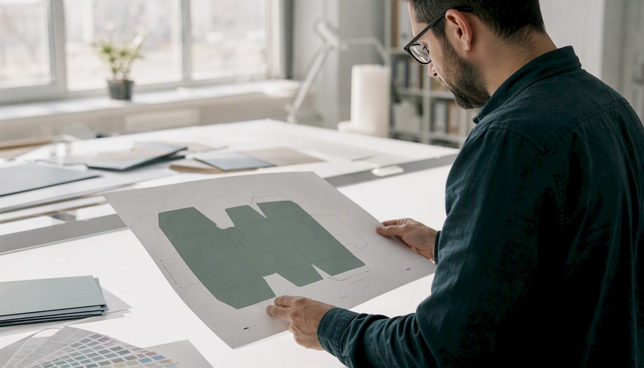
Our recommended workflow keeps those two categories separate by design. Dielines, logos, and all type are built and submitted as vector paths. Photographic elements, when a design calls for them, are linked as high-PPI raster files rather than embedded blindly, so our prepress team can verify resolution before anything goes to plate. The final submission comes together as a single PDF/X file with bleed, trim, and color mode locked in.
Here’s how that plays out on a typical order: a two-color logo paired with a full-bleed photo panel. The logo gets built in Illustrator with each color assigned as a spot color, not a CMYK build, to keep registration tight during flexo printing. The photo panel gets sized to its exact printed dimensions on the artboard first, then checked against our target PPI before it’s linked into the layout. Everything ships as one packaged folder: the working PDF, the linked photo at full resolution, and a short color note specifying the two spot colors by name.
Before you send us files, run through this quick list:
- Dieline supplied as vector, matching our template dimensions exactly.
- Logo and type as vector or properly outlined vector text.
- Photos linked (not just embedded) at their final printed size and resolution.
- Color mode set to CMYK or named spot colors, matching what you’ve confirmed with our team.
- Bleed and safe area marked according to the bag style you’re ordering.
Pro Tip: If you’re working from a template, download it fresh from our turn top bag design tutorial rather than reusing an old dieline. Bag dimensions and fold allowances vary by style, and a mismatched dieline is one of the most common causes of a delayed first proof.
Why Vector-First Thinking Pays Off on the Production Floor
After years of running bag orders through prepress and onto flexo plates, one pattern stands out: the orders that move fastest are the ones where the designer treated vector as the default, not the exception. A logo natively created with vector tools, with spot colors assigned from the start, sails through proofing because there’s nothing ambiguous for the prepress team to interpret. A logo pulled from a website as a JPEG often triggers a follow-up request, which can add delays.
The conventional wisdom treats raster and vector as roughly interchangeable design choices, something a client picks based on what software they happen to have open. In practice, on a production floor running 8-color flexo, the choice isn’t stylistic. It’s structural. A vector dieline holds its geometry through scaling and imposition; a raster one can introduce rounding errors that show up as a slightly misaligned fold weeks later. That’s not a hypothetical; it’s the kind of detail our in-house proofing catches before a plate gets cut.
What I’d push back on is the idea that raster is somehow the “lesser” format buyers should avoid entirely. That’s not right either. A photo panel forced into vector through aggressive tracing looks worse than an honestly prepared high-resolution raster every time. The real skill isn’t picking one format across the board. It’s knowing which parts of a design are structural (vector’s job) and which are photographic (raster’s job), and building your file so each element gets the treatment it actually needs. Our FSC-certified paper stocks and water-based inks reward that precision, too, since a clean vector logo prints with sharper registration on natural kraft than a soft raster approximation ever will.
Get Your Artwork Reviewed Before It Goes to Plate
If you’ve read this far, you already know the fastest way to lose a proof round: submitting a file where the format doesn’t match the element. Gather Packaging builds that check into the process from the start, not after a proof comes back wrong. Because we manufacture domestically in Toronto with in-house design support, prototyping, and flexo printing on-site, our team reviews your vector paths and raster resolution before a plate is ever cut, not after.
Our design and prepress team offers a few services worth using before you finalize an order: file review and prepress checks on any vector or raster artwork, prototyping so you can see a physical sample before a full run, 8-color flexo printing on FSC-certified and recycled stocks, and quality assurance testing specific to paper shopping bag production. If you’re weighing materials or ink types alongside your file prep, our sustainability page covers the eco-friendly substrate and ink options available for your run.
Ready to move forward? Reach out through our custom printed bag products page to start a quote, or contact our team directly to have your vector and raster files reviewed before you commit to a print run.
Share:
Kraft Paper Grades: A Buyer's Specification Guide
Ship Bags to Stores: A Retailer Checklist for Reliable Delivery