
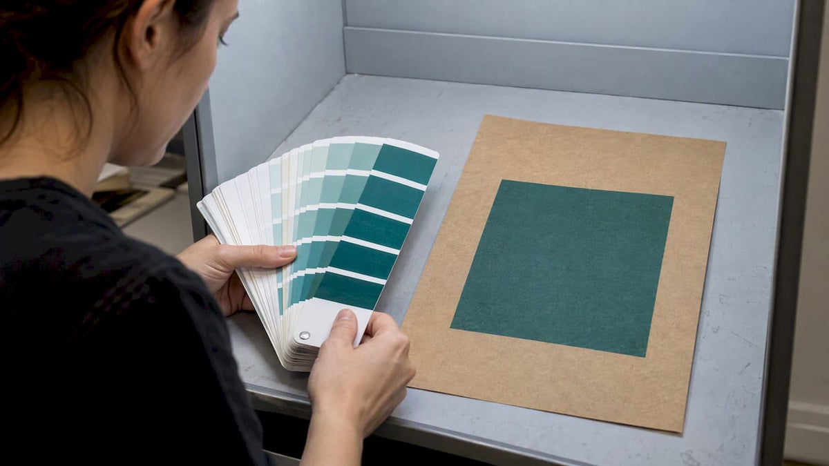
Yes, with limits: an exact Pantone match on brown kraft rarely looks identical to the same color on a coated or white stock, because the paper’s brown tone warms and mutes the ink underneath it. The highest-leverage fixes are using a substrate-dependent Pantone library built for kraft, requesting an opaque white underbase where the design calls for it, choosing an achievable dependent variant instead of a coated swatch, and proofing on the actual stock before production.
TL;DR:
- Choose a Pantone target from a kraft specific library before production; coated swatches and CMYK proofs on white stock cannot predict brown paper results.
- An opaque white underbase restores brightness for brand critical colors, but a second pass may be needed on dark stock and adds drying time.
- Approve a prototype printed on the exact kraft stock, then document acceptable color variation and inspect it under consistent lighting before production.
- For nonnegotiable brand colors, consider white kraft or litho wrapped packaging; direct printing on brown kraft cannot reproduce a coated stock match exactly.
Table of Contents
- How kraft paper changes color reproduction
- Practical techniques to get closer to a Pantone match on kraft
- Printing processes, inks, and capabilities that matter for kraft
- Proofing and color workflow for packaging on kraft
- Designer and print-buyer checklist for specifying Pantone on kraft
- How Gather Packaging handles Pantone matching on kraft
- Effect of paper texture and grain on Pantone color appearance on kraft
- Best practices for communicating color expectations between designers, printers, and clients
- Impact of environmental factors on final color perception on kraft
- Case studies comparing Pantone matching on kraft versus coated or uncoated substrates
- A quick rule of thumb for Pantone on kraft
- Get a prototype and quote from Gather Packaging
- FAQ
- Sources
How kraft paper changes color reproduction
Kraft paper is not a neutral canvas. Its natural brown fiber acts like a tinted filter under every layer of ink, and that filter warms and mutes the result, compared with how the same formula looks on white-coated paper. White-coated stock reflects more light back through the ink film, which is why colors read brighter and truer there. On kraft, that same light has to pass through a brown base first, so chroma drops and the print looks duskier than the swatch book promised.
Bright and pale colors take the hardest hit. A pastel blue or a clean lemon yellow can lose enough saturation to look washed out or disappear into the background entirely, while deep blues, greens, and reds tend to hold their identity better because they were already closer in value to the kraft tone.
This is also where digital proofing and CMYK conversion mislead a lot of designers:
- A spot color converted to CMYK on a white digital proof will not predict how it behaves once kraft is underneath it.
- Screen previews assume a white backdrop, so what looks accurate on a monitor can shift noticeably on press.
- The only reliable preview accounts for the substrate itself, not just the ink formula.
Setting expectations around this optical effect early saves a lot of frustration once bags come off press.
Practical techniques to get closer to a Pantone match on kraft
Once you accept that kraft changes the equation, a handful of shop-floor techniques close most of the gap between what you specify and what prints.
- Add an opaque white underbase. Laying white ink beneath the color coat blocks the brown fiber and lets the top color read closer to its intended value, though it adds a press station and setup time.
- Use multiple hits of white where one pass isn’t enough. A second pass builds opacity on darker or more saturated kraft stocks, at the cost of extra drying time and press passes.
- Consider dry-trapped or screen-printed white for small, high-value areas. This gives the cleanest opacity for a logo or a tight brand color but is more practical on select elements than full coverage.
- Select a target from a dependent Pantone library before production starts. Libraries built for kraft, including the Eco-Kraft library released for PantoneLIVE, show the closest achievable color on recycled brown kraft using water-based inks, so you’re approving a realistic target instead of chasing a coated swatch.
- Remix the ink formula when white underbase isn’t in the budget. Adding a small percentage of opaque white into the spot mix, or choosing a slightly darker or lighter Pantone variant than your first instinct, often gets you to an acceptable “best achievable” match without a full underbase.
Pro Tip: Decide upfront whether you’re matching a coated swatch or a kraft-dependent one. Approving the wrong reference guarantees a disappointing press check.
For buyers who want the underbase mechanics in more depth, our white underbase setup guide walks through mesh counts, flash temperatures, and fabric tests used in production.
Printing processes, inks, and capabilities that matter for kraft
The printing process you choose shapes how much of that color gap you can close. Flexo printing with water-based inks, paired with a substrate-dependent library, tends to be the most dependable route for recycled kraft because the process and the color standard were built around the same substrate behavior. Offset and digital printing can both run on kraft, but each carries different constraints on ink opacity and white-ink station availability.
White-ink capability is often the deciding factor:
- Whether a press has a dedicated white station, and how many hits it can lay down, determines how much brightness you can recover on a critical brand color.
- Anilox roll load and mesh selection control how much ink volume gets transferred, which affects both coverage and drying.
- A converter without white-ink stations will struggle to produce anything close to a coated-swatch look on brown kraft, regardless of the ink formula.
When a brand color is non-negotiable (a logo red, a specific teal), litho-wrapping printed paper onto a rigid substrate, or specifying a white-kraft alternative instead of natural brown, can hold that color far more tightly than direct kraft printing ever will. Our flexo versus offset comparison covers how these production choices play out for packaging buyers in more detail.
Proofing and color workflow for packaging on kraft
A proofing sequence built around kraft’s quirks catches color problems before they become a reprint. The steps build on each other:
- Confirm the substrate first. Recycled brown kraft, virgin kraft, and white kraft all behave differently under ink, so lock this down before any color conversation starts.
- Select a dependent Pantone swatch, using a PantoneLIVE Production preview tied to that specific substrate rather than a generic coated reference.
- Build a prototype with the requested white underbase treatment so you’re reviewing the actual ink stack, not a simulation.
- Run a press check on the intended stock, since digital proofs frequently render darker or flatter than an actual kraft print once substrate tone enters the mix.
- Sign off with documented tolerances, including the lighting conditions under which the proof was reviewed.
Pro Tip: Photograph proof approvals under the same light source you’ll use for final quality checks. A color that passes under warm store lighting can look off under daylight-balanced inspection lamps, and vice versa.
Defining acceptable variance in writing, not just “looks close,” gives everyone a shared reference when the production run doesn’t match a monitor exactly.
Designer and print-buyer checklist for specifying Pantone on kraft
A clear spec sheet keeps your converter from guessing. Before sending a file to print, confirm:
- Which Pantone reference you’re specifying: a dependent kraft library code (such as a brown-kraft flexo standard) rather than a coated or uncoated number alone.
- Where white underbase is required, called out explicitly in the file with its own layer or note, not assumed.
- How spot colors are built in the file: true spot channels versus CMYK conversions, since the two behave differently once white underbase enters the mix.
- Overprint and knockout settings around any white or light elements, so they don’t disappear into the kraft background.
- Trapping allowances and a documented tolerance for natural grain and texture variation in the paper itself.
- The converter’s white-ink capability, anilox and mesh specs, sample or prototype policy, lead times, and any prototyping fees, all confirmed before the quote is finalized.
How Gather Packaging handles Pantone matching on kraft
We build our paper shopping bags with 8-color flexo printing that supports white-underbase workflows, so a brand color gets a real shot at holding its value on brown or recycled kraft. Our process includes:
- Design assistance to flag where white underbase, trapping, or a dependent Pantone target will matter before a file goes to press.
- Pre-press proofing and prototyping so you see the actual ink stack on the actual stock, not a simulated preview.
- Quality assurance checks at each production stage, which cut down the risk of a reprint caused by a color surprise.
- FSC®-certified and recycled kraft stocks paired with water-based inks, matching the substrate behavior that dependent Pantone libraries are built around.
If you want to see how this plays out on your own design, reach out to discuss a prototype, a pre-press consultation, or a full RFQ for your paper shopping bags.
Effect of paper texture and grain on Pantone color appearance on kraft
Kraft’s texture does more than add a rustic look. The fiber grain scatters light unevenly across the surface, which means a solid color block can read slightly different from one spot to the next depending on how the paper’s surface catches light at that point. This is different from the uniform, smooth reflection you get off a coated stock, where the color looks consistent across the whole panel.
That texture also affects how much ink actually sits on the surface versus soaks into the fibers. A rougher, more absorbent kraft can pull ink down into the paper rather than letting it build up as a solid film, which further reduces the opacity and brightness of the final color, especially without a white underbase to block that absorption. A smoother, more calendared kraft holds ink closer to the surface and tends to produce a slightly cleaner, more even result.
For design work, this means treating grain and texture as part of the color spec, not a cosmetic afterthought. A tolerance range that accounts for natural grain variation, written into the proof approval, prevents a disagreement later over whether a bag’s color is “off” when it’s actually just the paper doing what paper does. Specifying a particular kraft weight or finish, and asking your converter how that stock’s texture has behaved on past runs, gives you a more realistic picture than color theory alone.

Best practices for communicating color expectations between designers, printers, and clients
Most color disappointments on kraft trace back to a conversation that never happened. The fix starts with naming the right reference at the start of the project: agree on whether you’re targeting a coated Pantone swatch, an uncoated one, or a kraft-dependent library code, and put that choice in writing before any art file gets built.
From there, a few habits keep everyone aligned:
- Share physical references, not just digital files, since screens and printed proofs can diverge once brown kraft is part of the equation.
- Document white underbase requirements directly on the artwork or spec sheet instead of describing them verbally.
- Agree on a tolerance standard before the press check, so a minor shift from natural grain or lighting doesn’t get mistaken for a production error.
- Keep one signed reference proof on file that everyone, designer, printer, and client, treats as the baseline for future reorders.
Clients often come into a kraft project expecting a coated-level match, so part of the designer’s job is translating what a dependent Pantone library can realistically deliver before the first quote goes out. A short explanation early, backed by a physical sample, prevents a harder conversation after a full production run is already printed.
Impact of environmental factors on final color perception on kraft
A color that passes inspection under one light source can look noticeably different under another, and kraft makes this more pronounced than white stock does. Warm incandescent or sodium-vapor lighting, common in some retail back rooms, pushes already-warm kraft tones further into the amber range, while cooler daylight-balanced LED lighting shows a more neutral, accurate read of the actual ink color.
Humidity plays a role too, though it shows up more in production than in the finished bag on a shelf. Paper fiber absorbs moisture from the air, and a kraft sheet printed in a humid shop can take ink differently than the same stock printed in a drier environment, affecting how much ink sits on the surface versus soaks in. This is one more reason a proof approved in one facility under one set of conditions doesn’t always travel perfectly to a different press run months later.
The practical takeaway is to standardize the viewing conditions for every proof approval and every quality check afterward. Reviewing a sample under the same lighting you expect at retail, and noting humidity conditions during critical press approvals, removes one more variable from a part of the process that already has enough variables built into the substrate itself.
Case studies comparing Pantone matching on kraft versus coated or uncoated substrates
The gap between kraft and other substrates is easiest to see side by side. A saturated spot color built for a coated white stock typically holds its full brightness and chroma there because the white base reflects light straight back through the ink. The same ink formula run on an uncoated white stock loses a little brightness since uncoated paper absorbs more ink, but the color family stays recognizable. Run that identical formula on natural brown kraft with no white underbase, and the same color often reads several shades darker and warmer, sometimes shifting enough that a pastel or bright tone loses most of its visual punch.
Add a white underbase to the kraft version, and the gap narrows substantially: the color recovers much of the brightness it had on coated stock, though it still carries a subtle warmth that a true coated match never will. This is the practical argument for treating kraft not as a lesser version of coated printing, but as its own substrate with its own achievable standard, one best measured against a dependent Pantone library built for kraft rather than against a coated swatch that was never going to translate directly.

Brands that go in expecting this difference, and that plan white underbase or a dependent color target from the start, consistently end up closer to their intended look than brands that approve a coated proof and hope kraft will match it.
A quick rule of thumb for Pantone on kraft
Plan for muted, warmer results on brown kraft, and treat white underbase as a requirement for any color your brand can’t compromise on, not an optional upgrade. A dependent Pantone target approved early beats a coated swatch chased all the way to press.
If you’re specifying a brand-critical color for your next bag run, a prototype will tell you more in a week than another round of digital proofs will.
— Taylor
Get a prototype and quote from Gather Packaging
Getting Pantone right on kraft comes down to seeing it printed before you commit to a full run, and that’s exactly what our prototyping process is built for. We manufacture paper shopping bags domestically with 8-color flexo printing, white-underbase capability, and in-house quality assurance, so you can review an actual proof on your chosen kraft stock instead of guessing from a screen.
Our services include:
- Turn top, serrated top, and tamper-resistant bag styles in FSC®-certified and recycled kraft.
- Design assistance and die-line preparation advising on white underbase and trapping needs.
- Pre-press proofing and prototyping on your actual stock, not a simulated preview.
- Production designed to minimize turnaround and shipping times.
Reach out through our contact and consultation page to request a prototype, a pre-press review, or a full quote for your next paper shopping bag order. You can also browse our kraft paper bag options to see the stocks and styles available for your next run.
FAQ
What is the CMYK code for kraft paper?
There isn’t a single CMYK code for kraft, because kraft is an uncoated, colored substrate rather than a printable ink value. Designers instead reference a dependent Pantone library built for kraft, which accounts for how the brown fiber shifts ink appearance.
How do you match a color to Pantone on a brown substrate?
Start by selecting a substrate-dependent Pantone standard, such as a code from the Eco-Kraft library, rather than a coated swatch. Confirm the match with a physical proof printed on your actual kraft stock, since digital previews don’t reliably predict how the substrate will shift the final color.
Is Pantone the same as RAL?
No, Pantone and RAL are separate color matching systems used in different industries, with their own swatch books and numbering conventions. Packaging and print work typically references Pantone, including the substrate-dependent libraries built for kraft and other specialty stocks.
Can you print directly on kraft paper?
Yes, kraft paper accepts flexo, offset, and digital printing, though the brown fiber base changes how colors appear compared with white stock. Many converters add a white ink underbase for brand-critical colors to recover brightness that the kraft tone would otherwise mute.
Sources
- How color prints on kraft paper: What to expect and what to avoid | 4OVER4
- X-Rite, Pantone and Sun Chemical Release New Eco-Kraft Corrugated Packaging Library for PantoneLIVE
- PantoneLIVE Production | X-Rite Print & Packaging
- Color rendering with direct offset printing on brown kraft cardboard | PrintPlanet
Share:
Plate Relief and Patterning Control Flexo Trapping for Paper Bags
Handle Attachment Methods for Paper Bag Buyers: Test the Failure Point